Design System with Logic-Driven Tokens
We were redesigning multiple workflows at the same time, but the design infrastructure couldn't keep up. Designers were picking inconsistent tokens, engineers were guessing at implementation intent, and the codebase was accumulating hard-coded styles. I built a 3-layer token architecture from scratch that gave both sides a shared language.
Solo Product Designer
dotData Enterprise AutoML Platform
1 designers, 1 engineers
Design Systems, Token Architecture, Design-Dev Alignment
Where It Started
When I joined, the company had no real design library. Designers were recreating components independently, engineers were coding from memory or guesswork, and the codebase was full of hard-coded styles that nobody wanted to touch. My design lead asked me to audit what we had — go through the existing designs, talk to engineers, and figure out what was actually in the code versus what was in the files.
What I found wasn't pretty. Similar colors with slightly different hex values that should've been the same token. Components that existed in three different files with no clear source of truth. Engineers who'd stopped asking designers questions because the answers were inconsistent anyway.
I built the first version of the design system from scratch. Started with the smallest building blocks — color, typography, spacing — and worked up to buttons, input fields, and larger composed components. We were on Sketch at the time, using Zeplin for handoff. It worked, mostly, until it didn't.
Fragmented Foundation
Without a centralized library, teams recreated components independently, causing visual inconsistencies across the product.
Ambiguous Implementation
Without logic-driven specs, engineers relied on guesswork — the production code regularly diverged from design intent.
Escalating Technical Debt
Hard-coded CSS variables and styles accumulated, making every new feature harder to build consistently.
Why We Had to Do It Again
The Zeplin problem took a while to surface fully. Every time a component changed, the update chain looked like this: update the component → update the clean screens → update InVision → update Zeplin. If anyone missed a step — and they did, often — engineers would find themselves implementing from an outdated spec. We started getting Slack messages: “Which version is the real one?”
When the team decided to redesign the enterprise platform and migrate to Figma, it felt like the right moment to fix the system properly, not just migrate the files. Figma solved the “which version is real” problem immediately — everyone's in the same file, and engineers can inspect elements directly. But I noticed something else after the first redesign shipped.
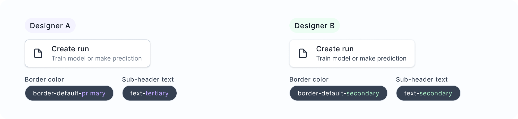
The other designer and I were making different calls on the same components. She'd reach for border-default-primary and I'd use border-default-secondary. Neither of us was exactly wrong — the semantic tokens were abstract enough that they could reasonably be interpreted in multiple ways. We didn't have a “when to use which” doc, and honestly, even if we'd written one, it would need to be maintained and actually read.
I thought about writing documentation first. But documentation has two failure modes: people don't read it, and it falls out of date. I wanted the system itself to encode the decision logic.
Adding a Third Layer
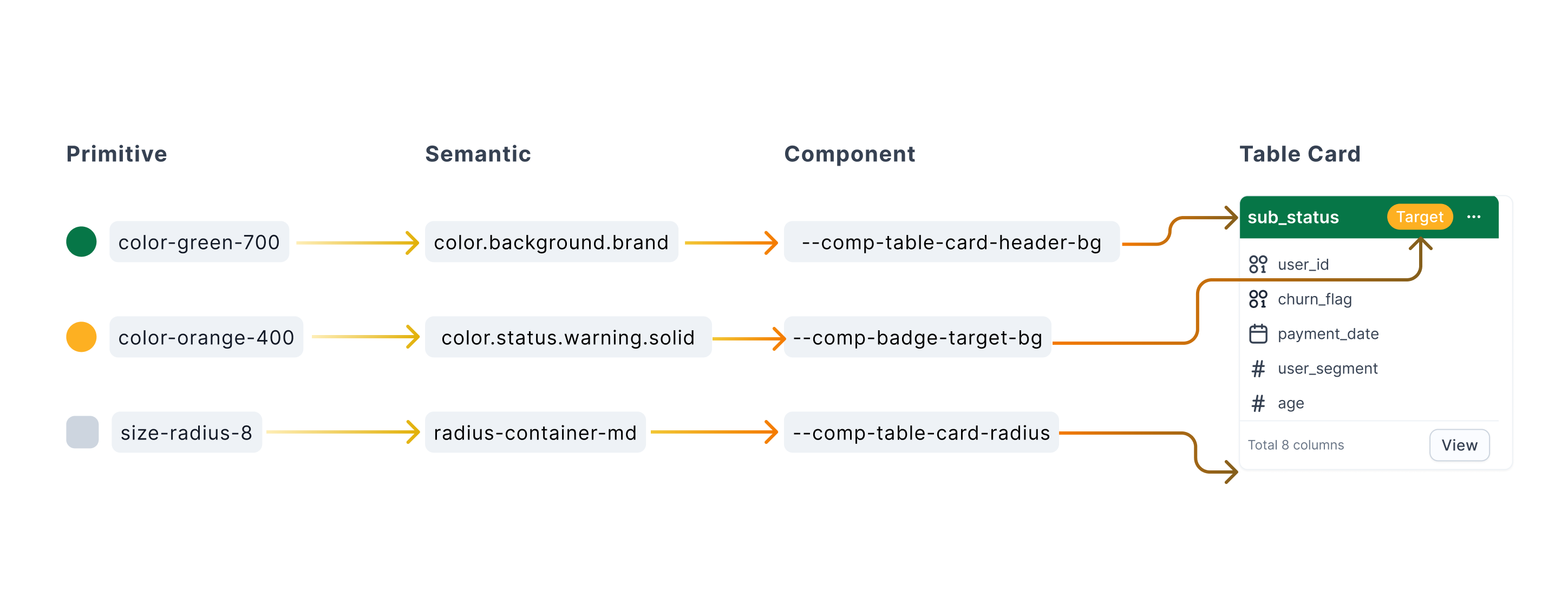
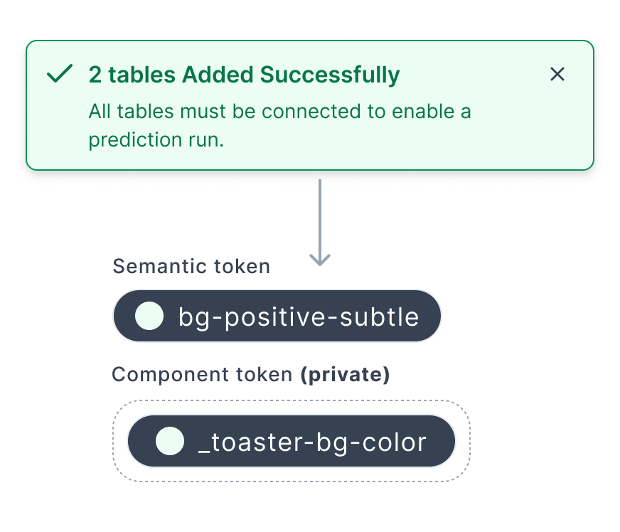
The missing layer was Component tokens — a private layer that sits between Semantic and the actual UI element. Instead of a button reaching directly for a semantic color token and hoping it's the right one, it uses --button-bg, which maps to the correct semantic token for that specific context.
color-green-700 → color.background.brand → --comp-table-card-header-bg
Each layer has a different job. Primitives are raw values. Semantics carry meaning. Component tokens carry intent — the functional role of a specific UI element. That precision is what designers and engineers were both missing.
2-Layer (Before)
Designers choose from semantic tokens directly. Similar-sounding options create inconsistent decisions.
Cons: ambiguous token selection, inconsistent output
3-Layer (After)
Component tokens define the functional role of each UI element. Designers apply logic, not just color.
Pros: precise intent, consistent implementation, less cognitive load
Key Decisions
Keeping Component Tokens Private
One early question was whether to publish component tokens globally so any designer could use them anywhere. I decided against it. Component tokens are scoped to specific modules — they're not meant to be reused across unrelated contexts.
Keeping them private meant the library stayed manageable, and designers couldn't accidentally apply a table card token to a form field. A few people thought this would create more work. I agreed it added some friction — but global component tokens would've created token sprawl faster than we could manage it. System stability over automation, at least at this stage.
Keeping General Semantic Tokens Available
When I first introduced component tokens, I unpublished the general semantic tokens to push designers toward the new layer. It broke things immediately. Designers working on features that didn't have component tokens yet had nothing to reach for.
So I kept a set of general semantic tokens published for those in-between moments — components still in design, features not yet scoped. The component token layer sits alongside, not on top of. New patterns earn their way in through an audit; edge cases stay flexible on the semantic layer.
Progressive Adoption, Not a Hard Cutover
We had two designers and eight engineers redesigning multiple workflows simultaneously. Launching with a comprehensive system would've meant maintaining a huge library before we'd validated any of the product decisions.
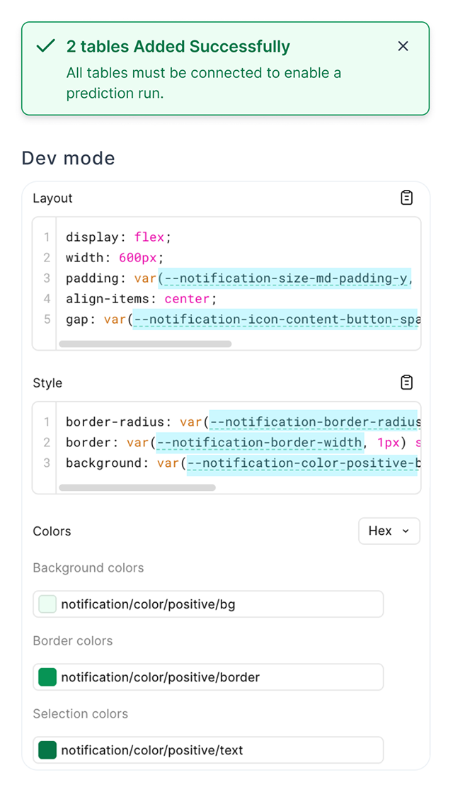
So we launched with two layers. Once the first version shipped and things stabilized, I went back to engineering to introduce the component token layer. The architecture is fully built in Figma, aligned to engineering naming conventions so developers can inspect the intended token logic directly in Dev Mode when they're ready to implement — no separate spec docs needed.
Impact
5 → 2
steps in the handoff workflow
from update component → clean screens → InVision → Zeplin → engineer, down to update component → clean screens
↓
engineering questions per month
from roughly once a week to once a month after engineers could self-serve in Figma Dev Mode
↑
architectural scalability
built to support dark mode and multi-theme without redesigning core components
In design reviews, the spec questions mostly disappeared. We spend that time on actual design decisions instead.
Reflection
The hardest part of this project wasn't the token architecture — it was convincing the team that the problem was worth solving at all. Everyone was busy shipping features. The design system felt like overhead.
What shifted the conversation was making the cost of inconsistency visible. I audited the production codebase and counted how many hard-coded color values existed outside the token system. That number got people's attention.
I also used AI in parts of this project — generating color pattern documentation, working through token naming conventions, and drafting component specs. Mostly to get something on the page faster, then edit from there.
Where It Is Now
The two-layer system is in production across the platform. The component token layer is live in Figma — full implementation in code is still in progress, but the architecture is ready.
When engineering has capacity, the system can extend into dark mode or multi-theme support without restructuring anything at the foundation. The question for the next phase is always the same: what gets promoted to a component token, and what stays one-off? The governance workflow makes that decision consistent — recurring patterns go through an audit and get promoted; edge cases stay on the open semantic layer.