Enterprise AI · dotData · Senior Product Designer
Redesigning Enterprise AutoML: Reducing Time-to-Value for business analysts by 40%
-50% Setup Time
From 10 to 5 minutes avg. configuration.
Zero DS Dependency
Empowered business analysts to run models independently without data science teams.
+40% Time-to-Value
Significantly accelerated the workflow for enterprise users.
The Problem
A partner trained 80 business analysts on our AutoML platform, but fewer than 5 remained active. The product growth in the US market had frozen.
Key Insights from Support Tickets & User Research:
- ML Workflows are Non-Linear: Users needed to iterate and go backward based on model results, but the existing system forced a rigid, one-way flow.
- The Expert Trap: Users were forced to manually configure data types and define schemas before uploading—steps they didn’t understand or care about.
- The Competition:Enterprise customers expected a visual, drag-and-drop experience “With other tools, you can just drag and drop...”.
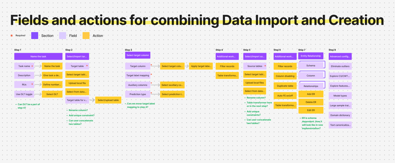
The Pivot: Object-Oriented Design
To bridge the gap, I mapped out every object and relationship in the system. This shared artifact alignment changed our technical and UX direction:
- Eliminating Friction: Challenged engineers on real technical constraints, removing unnecessary configuration fields, e.g., manual source data types.
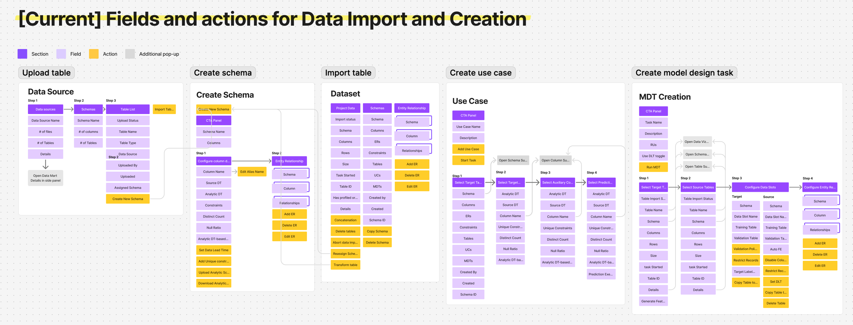
Before: 「Five isolated entry points. A mistake in step one meant starting over from scratch.」
- The Canvas Aha-Moment: Realizing the workflow was highly iterative, we shifted from a guided wizard to a single canvas workspace so users could see table relationships live, avoiding “one-way doors.”
v1: merging isolated entry points into a guided setup wizard
The Solutions
01
Guided Entry via Adaptive States
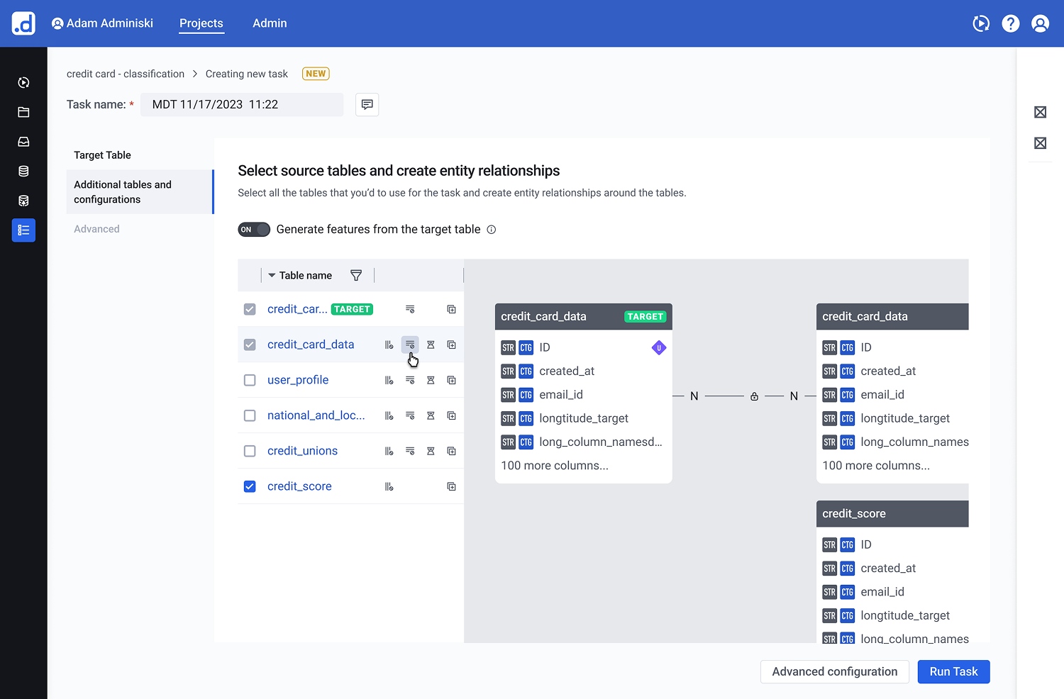
The Pattern: A progressive disclosure layout that replaces blank-canvas anxiety with a clear starting point.
By opening with the import panel active and keeping subsequent action zones disabled, the interface provides a natural, step-by-step onboarding sequence without enforcing a rigid wizard constraints.
Figure 1.1: Adaptive Initial State for Frictionless Onboarding. The workspace layout utilizes adaptive states to steer non-technical users through the initial table connection, focusing cognitive effort purely on the first critical action.
02
Real-Time Table Exploration
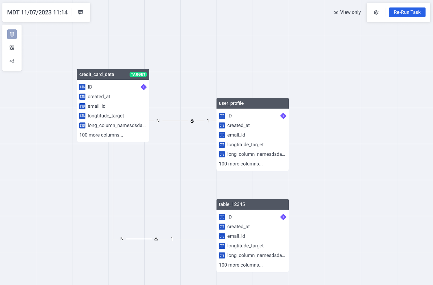
The Pattern: A space-efficient card structure tailored for dense entity-relationship (ER) models.
Each table card utilizes a fixed-height scroll container that dynamically surfaces active relationships to the top. Interactive connection links trigger inline ER previews upon hover, preserving situational awareness while minimizing overall canvas noise.
Figure 2.1: Contextual ER previews on hover eliminate canvas noise while preserving situational awareness during multi-table exploration.
03
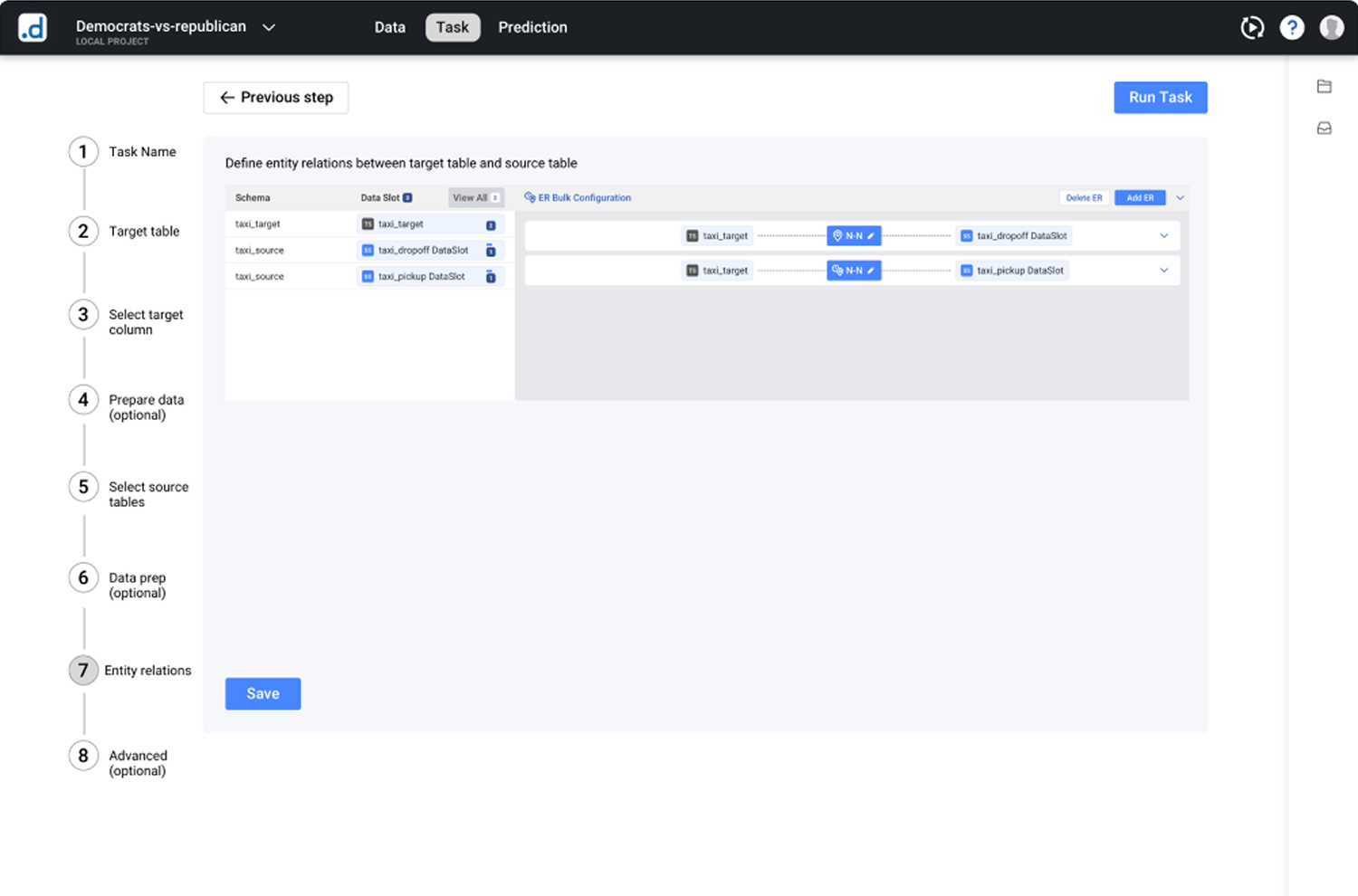
Semantic Auto-Connect & Contextual Config
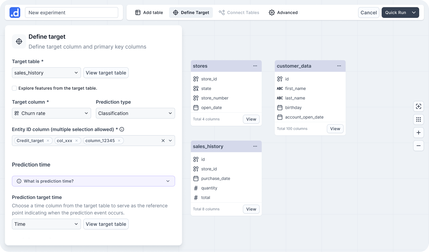
The Pattern: Knowledge-free data configuration using proactive system defaults.
Schema-based relationship suggestions eliminate the need for advanced database knowledge. Complex time-related configurations are embedded directly within the relevant data context, featuring pre-filled smart defaults and concrete, real-data examples to replace abstract inputs.
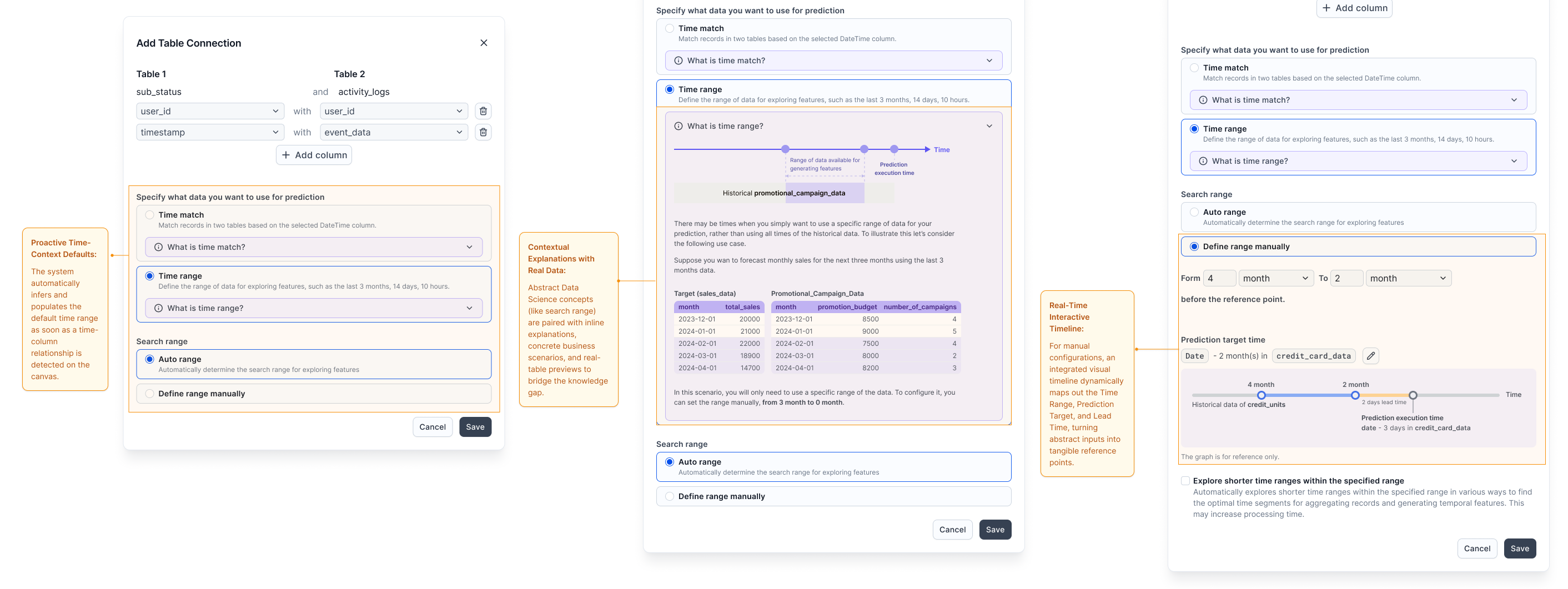
Figure 3.1: Contextual Configuration Pipeline. Rather than forcing users into an all-or-nothing configuration form, the layout guides them through a progressive journey: leveraging system intelligence first, providing educational context when needed, and offering interactive real-time feedback during manual adjustments.
Validation
Driving Both User and Business Success
We validated the single-canvas workspace and the guided configuration pipeline through usability testing with business analytics students, alongside tracking post-launch enterprise telemetry:
- 45% Friction Reduction: Data import and configuration support tickets—which previously made up over half of all incoming volume—dropped significantly after release.
- 50% Faster Time-to-Value: Average configuration time for a multi-table schema dropped from 10 minutes to just 5 minutes.
- 100% Unassisted Completion: Users completed complex, non-linear model configurations entirely on their own for the first time, without relying on data science intervention.
- Commercial Re-engagement: Sales teams, who had previously stopped demoing the data onboarding module due to its high friction, proactively integrated the new canvas experience back into key enterprise sales cycles.
One tester’s struggle to connect a static definition to the panel led directly to the interactive timeline — turning a concept into a visible tool.
Reflection & Next Frontiers
Designing Complex B2B Systems is the Art of Sacrificing Noise
The most significant challenge in this redesign was not adding more clarity or help text. It was ruthlessly deciding what to hide. In enterprise software, there is a constant tension between giving power-users complete control and preventing non-technical users from second-guessing themselves. Success meant providing just enough signal (like real-data previews) to build trust, while suppressing technical noise (like legacy database schemas) to maintain momentum.
Bridging the Engineering-Product Gap via OOD
Moving away from a rigid wizard to an open canvas required massive alignment across engineering and product teams. Utilizing Object-Oriented Design (OOD) as a shared artifact allowed us to debate technical constraints objectively. It proved that a product designer’s role in complex domains isn’t just making interfaces intuitive, but actively simplifying the underlying system architecture alongside engineering.
The Next Frontier: Closing the Feedback Loop
If I were to iterate further, the next step would be connecting configuration choices directly to model performance. Currently, users configure tables blindly without knowing how their choices impact the final machine learning accuracy. Closing this loop by bringing predictive confidence metrics earlier into the canvas workspace would truly elevate the experience from “configuring data” to “co-authoring AI.”
Bonus · Speculative Design
Beyond the canvas — reimagining with agentic AI
The canvas solved visibility, but still assumed users arrived with a clear use case. With agentic AI, we can shift from “configuring a tool” to “collaborating with an expert.” I used Cursor to prototype what this could look like.