- Company
- Kahuna
- Industry
- Marketing analytics, B2B SaaS
- Role
- UX Designer
- Scope
- Research, IA, data viz, interaction, visual design
- Team
- Product, Design, Engineering
Redesigning Kahuna’s campaign dashboard so marketers could find the insight, not just the numbers
Summary
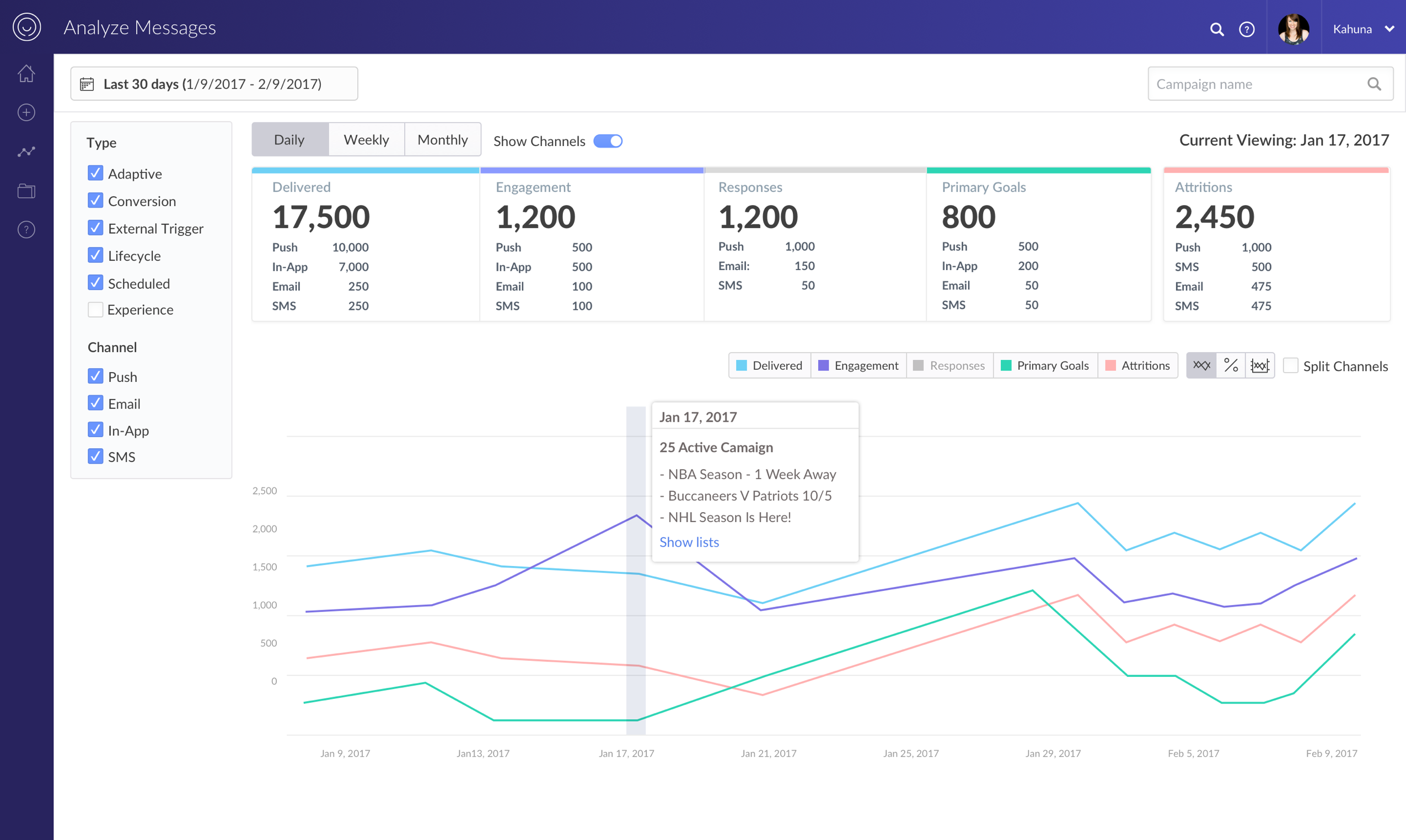
I redesigned Kahuna’s campaign performance dashboard so marketers could answer “is this campaign working?” without drowning in metrics, inconsistent toggles, or a filter bar that ate the first two rows of the screen.
Research with 13 campaign managers and marketing heads shaped a left-rail filter, a smaller set of high-level KPIs, and a visualization model that could add channels without splitting the story across charts.
The context
Campaign managers send campaigns to onboard new users, drive engagement, or retain people who are slipping away. After launch, they need to know whether delivery is on track and whether the campaign is actually working.
My goal was a campaign performance dashboard that made those insights easy to find — not a wall of numbers that required a specialist to interpret.
Design challenge
Design a performance surface that leads with decisions, stays scannable as Kahuna adds channels, and keeps the selected filters in view — so marketers can move from “is this working?” to “what should we change?” without fighting the UI.
The dashboard was hard to read and harder to trust
Customer feedback clustered around two issues: confusing interaction, and missing or poorly presented KPIs. Some tiles were static and some were toggles, with no visual distinction. Channels were icons. Split charts made it difficult to compare an overall trend. Finding a specific campaign meant scrolling an infinite list. Date range ate the first two rows.
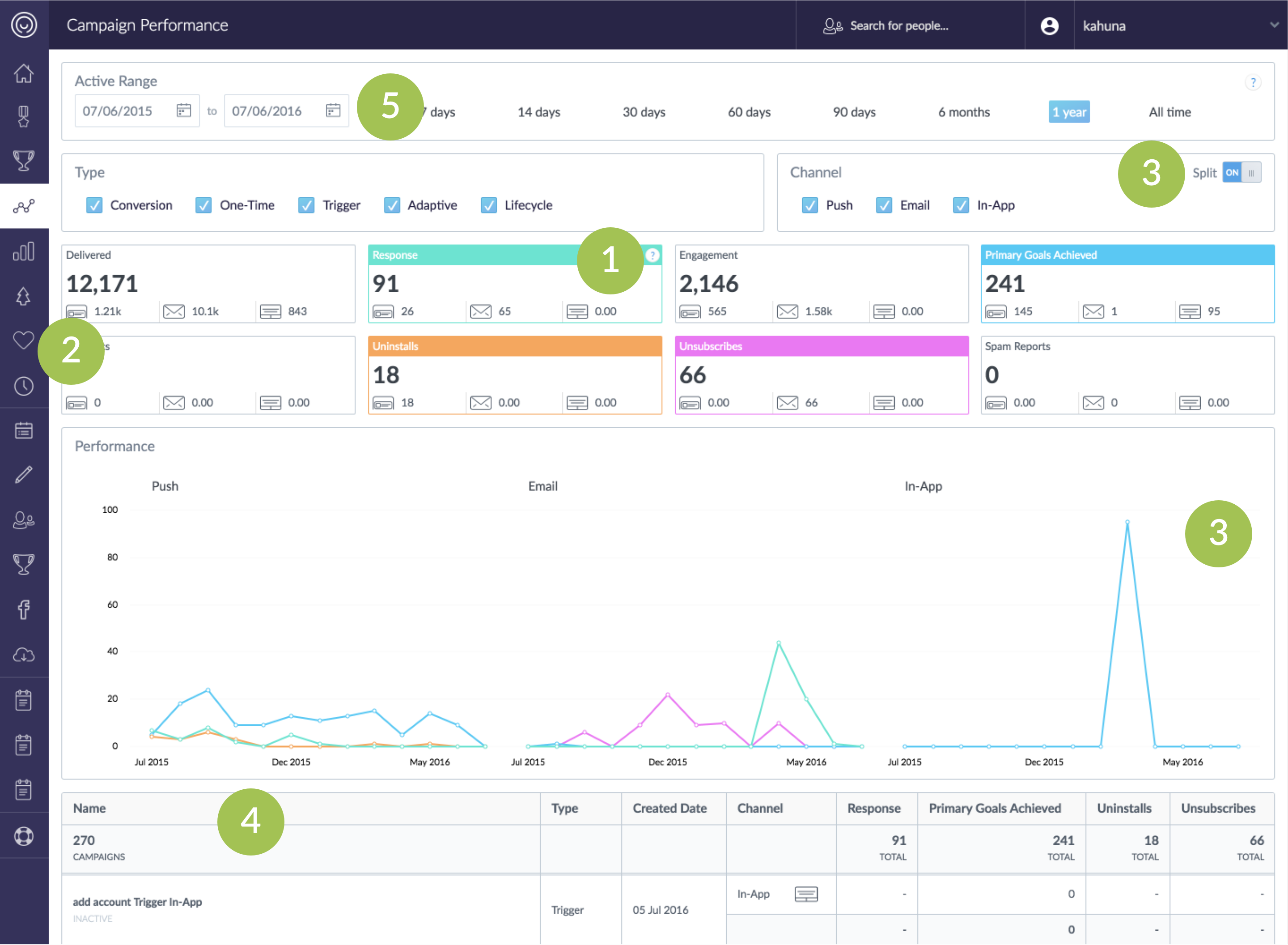
The existing Campaign Performance dashboard, annotated with the five issues that kept coming up in customer feedback.
What was breaking down
- KPI tiles mixed static cards with hidden toggles — new users did not know what they could click.
- Channel icons were hard to recognize, especially once more than a couple of channels were in play.
- Splitting channels into separate charts made it difficult to compare and read the overall trend.
- An infinite-scroll campaign list made a specific campaign hard to find.
- Date range and filter controls took too much vertical space before any insight appeared.
What campaign managers and marketing heads actually needed to see
To understand how marketers monitored a campaign, and where the current workflow failed them, we interviewed six campaign managers and seven heads of marketing.
We have different goals for different campaigns, but I mostly care about the conversion rate.
Needs aggregate and detailed metrics, then uses past-campaign data to form hypotheses for the next send.
Needs high-level engagement, goals, and conversion — and a trend that can be presented to the executive team.
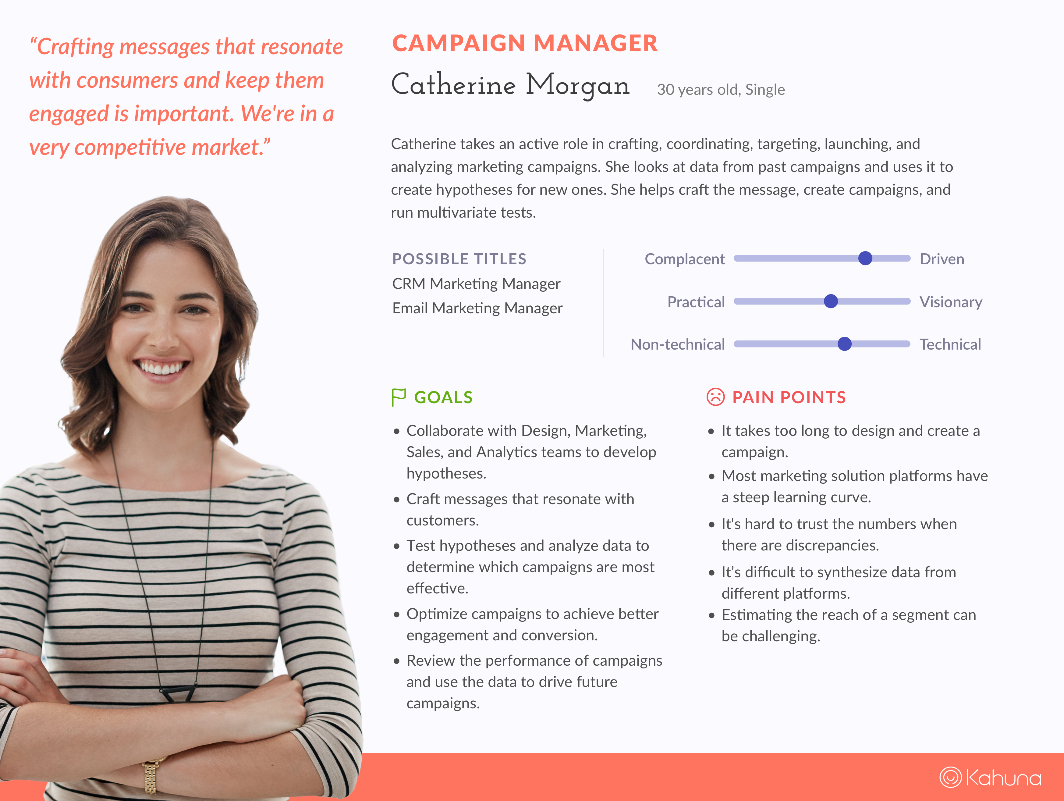
Catherine, Campaign Manager — she analyzes campaigns in aggregate, then dives into the data to test hypotheses for the next one.
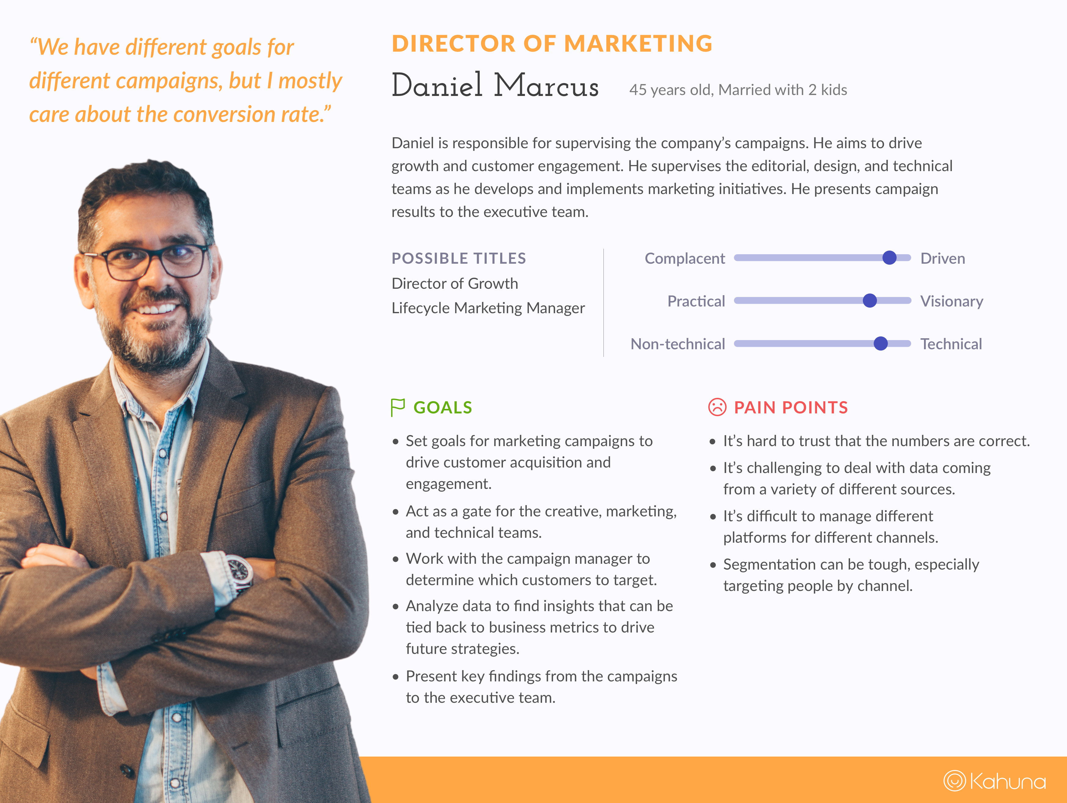
Daniel, Head of Marketing — he watches high-level engagement, goals, and conversion, then maps the trend back to business strategy.
Key findings
- Both audiences care about the numbers — the disagreement is which numbers, and at what altitude.
- Heads of marketing read high-level metrics and trend to set strategy.
- Campaign managers watch delivery, test hypotheses, and judge whether the campaign is effective.
Simplify the interaction, then make it scale
Kahuna planned to offer more channels. The current interface could not absorb that growth. We used the research, the existing pain points, and that business constraint to prioritize what to fix first.
What we set out to improve
Remove hidden interaction
Eliminate togglable KPI tiles and other controls that looked static until someone happened to click them.
Give filters a real home
Clean up and relocate date range and filter selection so they no longer consumed the first two rows of the dashboard.
Make the campaign list searchable
Replace infinite scroll with a list people could scan, search, and keep in context.
Design for more channels
Build a layout and KPI model that could add SMS — and whatever came next — without splitting the story across charts.
Where does the filter live?
Campaign managers review performance and use it to plan the next send — so they need to know what is currently filtered. On the existing dashboard, those controls took the first two rows.
I sketched three placements, then reviewed them with product managers and the design team.
Three options
Expand in place
A filter toggle reveals the panel and pushes content down. It saves space, but the main view jumps, and collapsed filters disappear — people can no longer see what they selected.
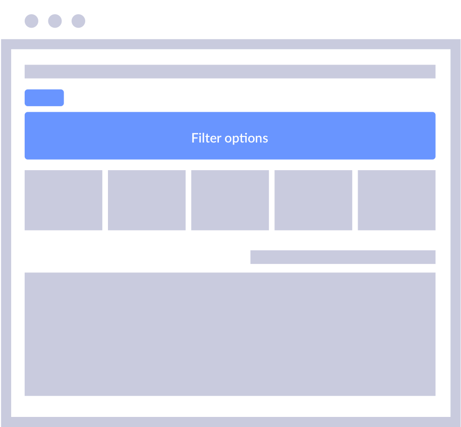
Filter options expand as a full-width bar above the KPI row.
Popup panel
A toggle opens filters as an overlay. It also saves space, but it covers the data, hides the current selection when closed, and sits in a weak spot in the hierarchy — changing a filter affects both KPIs and the chart.
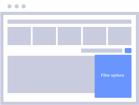
Filter options as a popup over the main content.
Fixed left rail
Filters stay on the left. It uses more width, but the selection is always visible, and changing a filter and reading the result happen in the same glance. We shipped this one: hiding filters saved space, but most people preferred to see what they had selected.
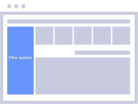
A persistent left panel keeps type and channel in view beside the dashboard.
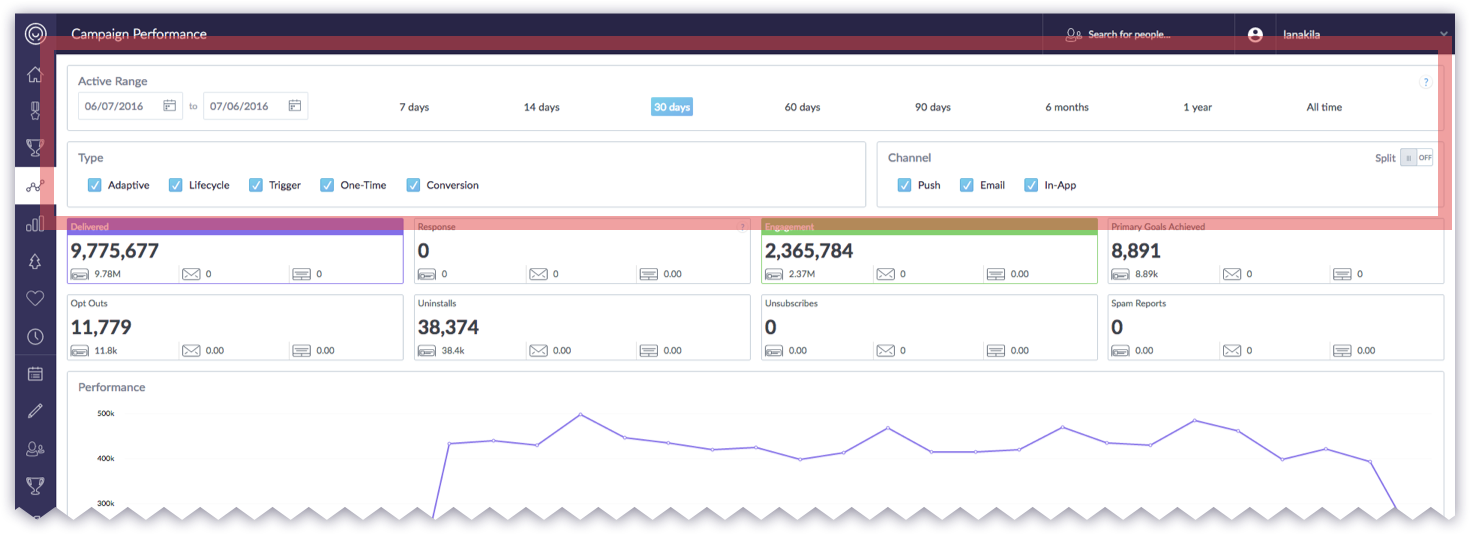
The current screen: date range, type, and channel occupied the first two rows before any KPI or chart appeared.
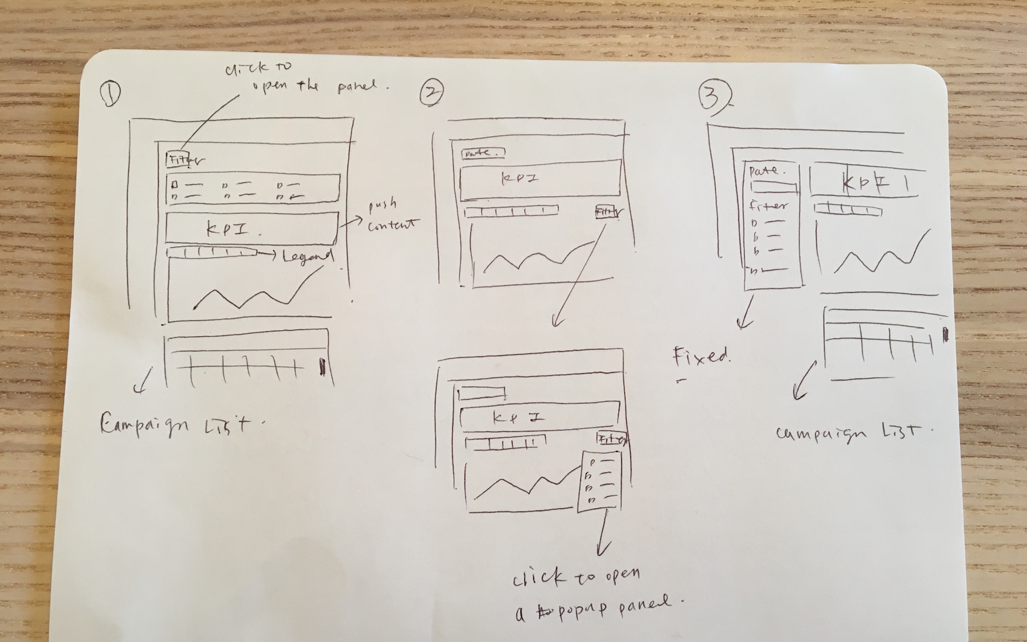
Early sketches: expand-in-place, a popup panel, and a fixed left rail. The question was not only space — it was whether the selected filters stayed visible.
High-level metrics, not a tile for every channel
Across Kahuna’s analytics dashboards, some KPI tiles toggled series on the chart and some did not. Customer Success told us most people never realized the difference.
Scalability made it worse. More channels meant more breakdowns, and some metrics only existed for one channel — unsubscribe for email, for example. Showing every metric as a tile would not hold.
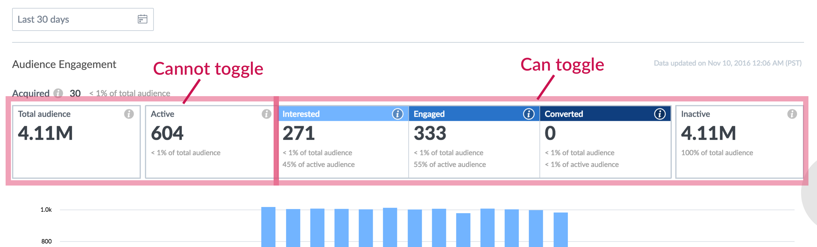
On the engagement dashboard, some tiles were static and some were toggles. The interaction was not labeled, so the pattern could not be learned.
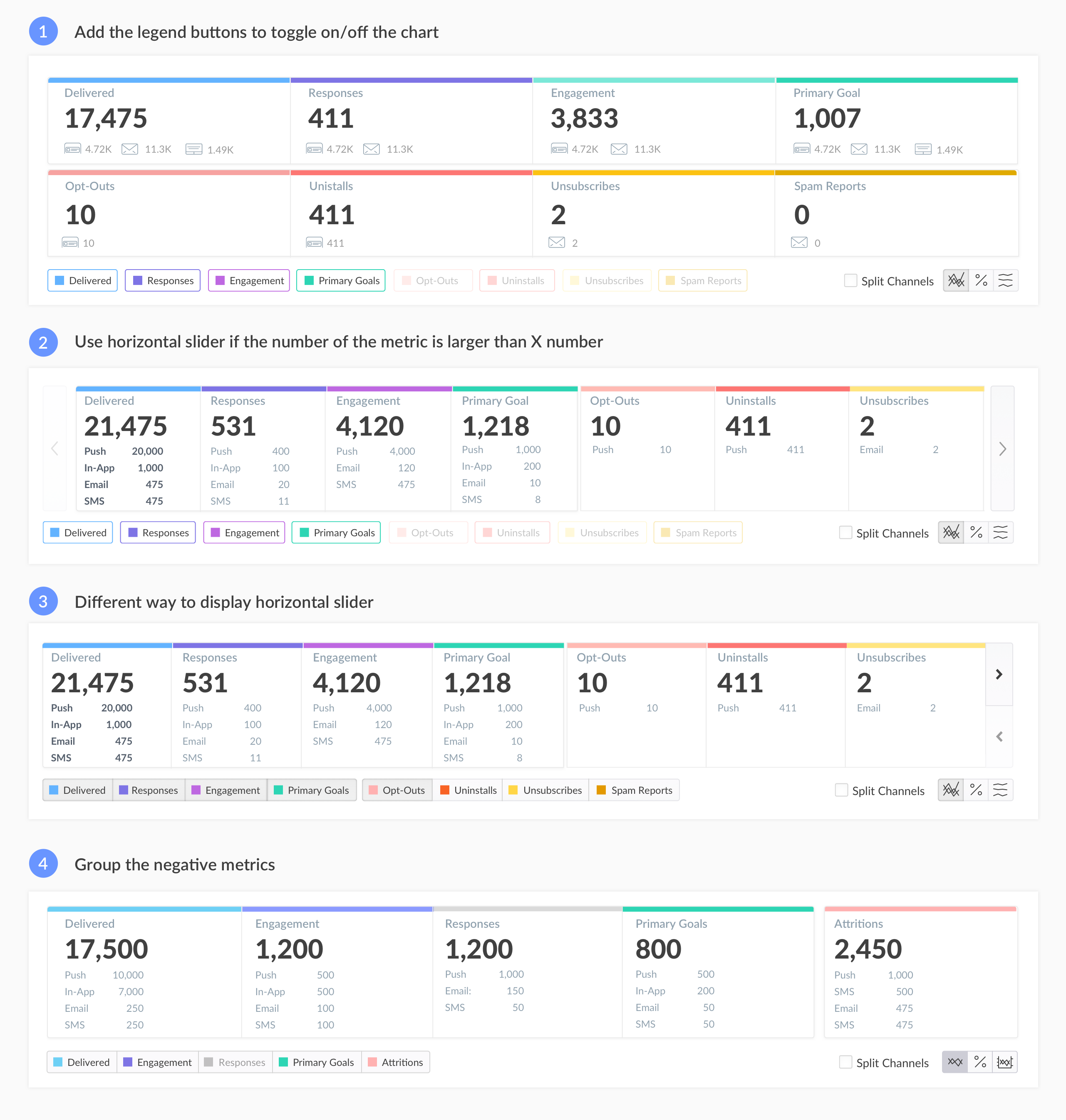
Iterations: two rows of mixed positive and negative metrics, a horizontal scroller, and the direction we shipped — five high-level tiles with negative metrics grouped as Attritions.
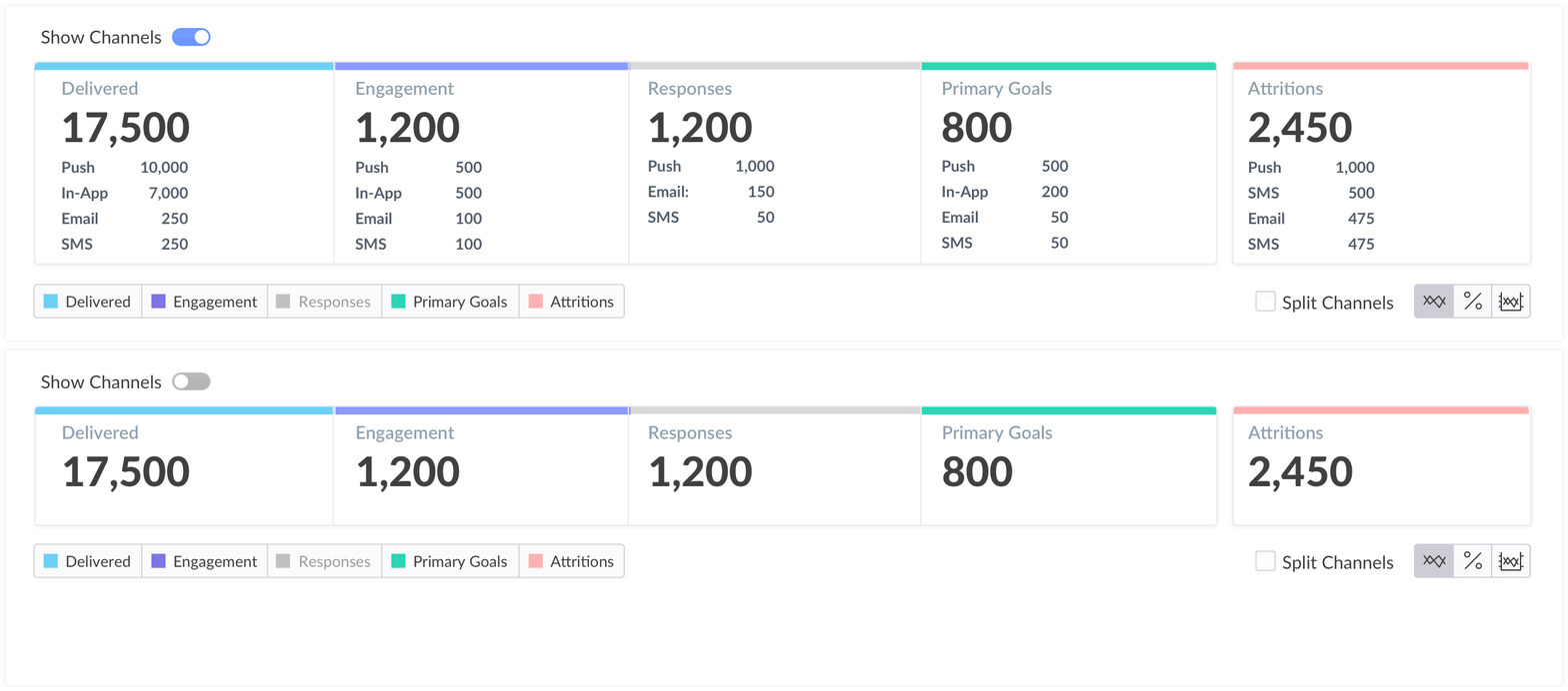
A Show Channels toggle reveals per-channel counts on the tiles without adding a tile per channel. Detail lives on the individual campaign.
Show only high-level KPIs. Bucket negative metrics as Attritions. Use a channel toggle for breakdowns. If someone needs the long tail of metrics, they open the specific campaign.
One component set, so every analytics view could scale
To make the redesign scale beyond this dashboard, I inventoried reusable pieces, standardized color and layout, and cleaned up the rest of the analytics surfaces so they shared one visual language.
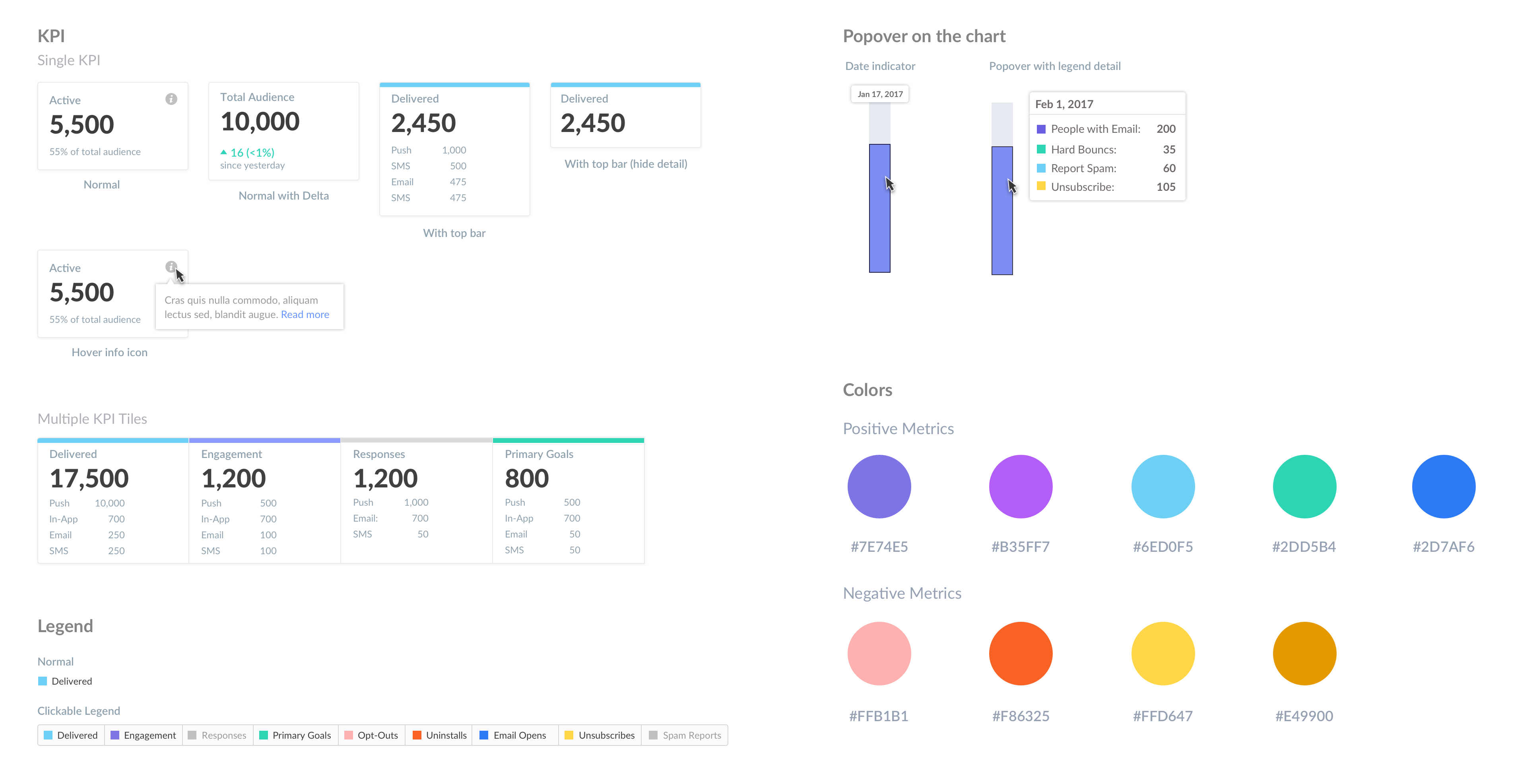
The component kit: KPI tiles with and without channel breakdown, clickable legends, chart popovers, and a split palette for positive versus negative metrics.
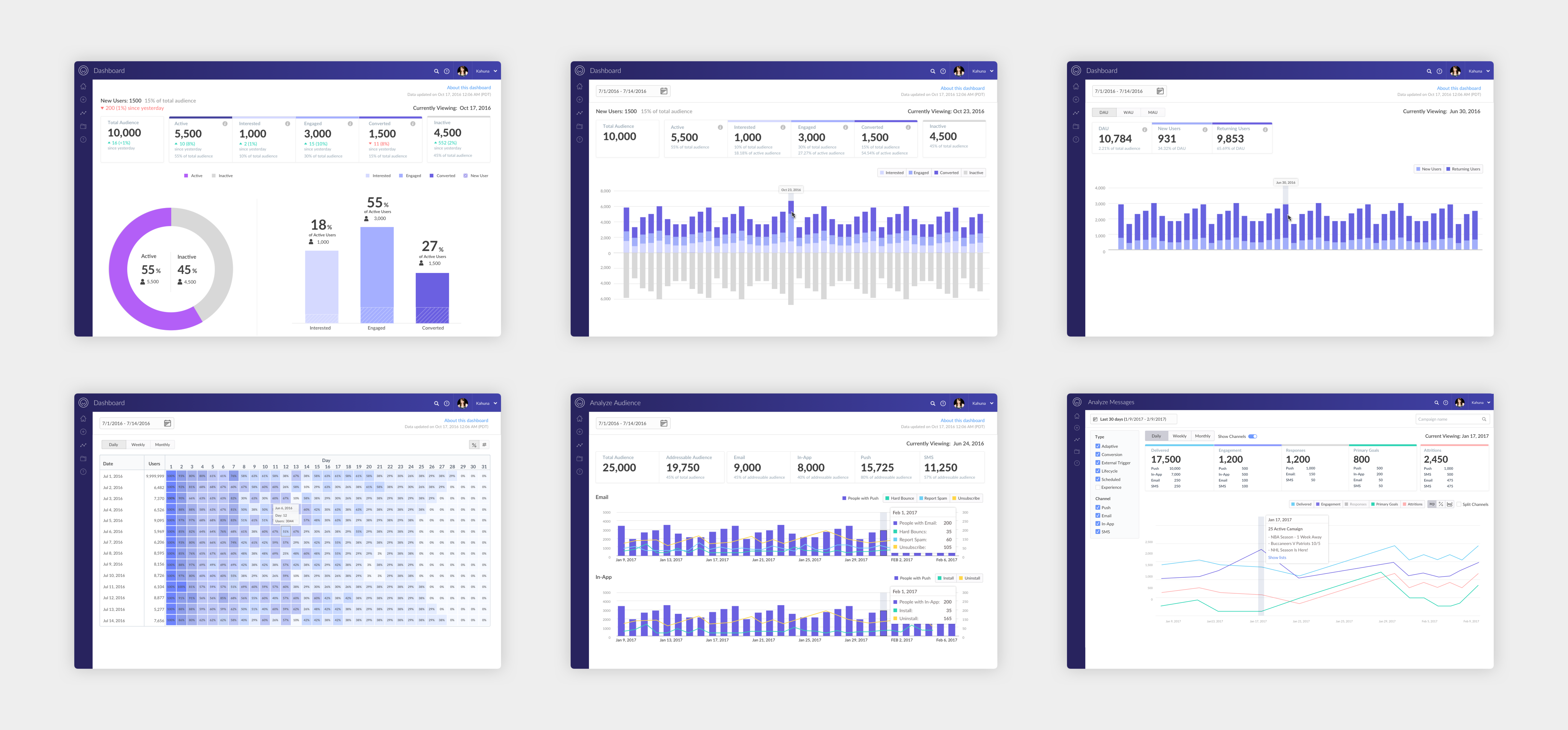
Applying the same layout, color, and tile language across Kahuna’s analytics dashboards so none of them felt like a one-off.
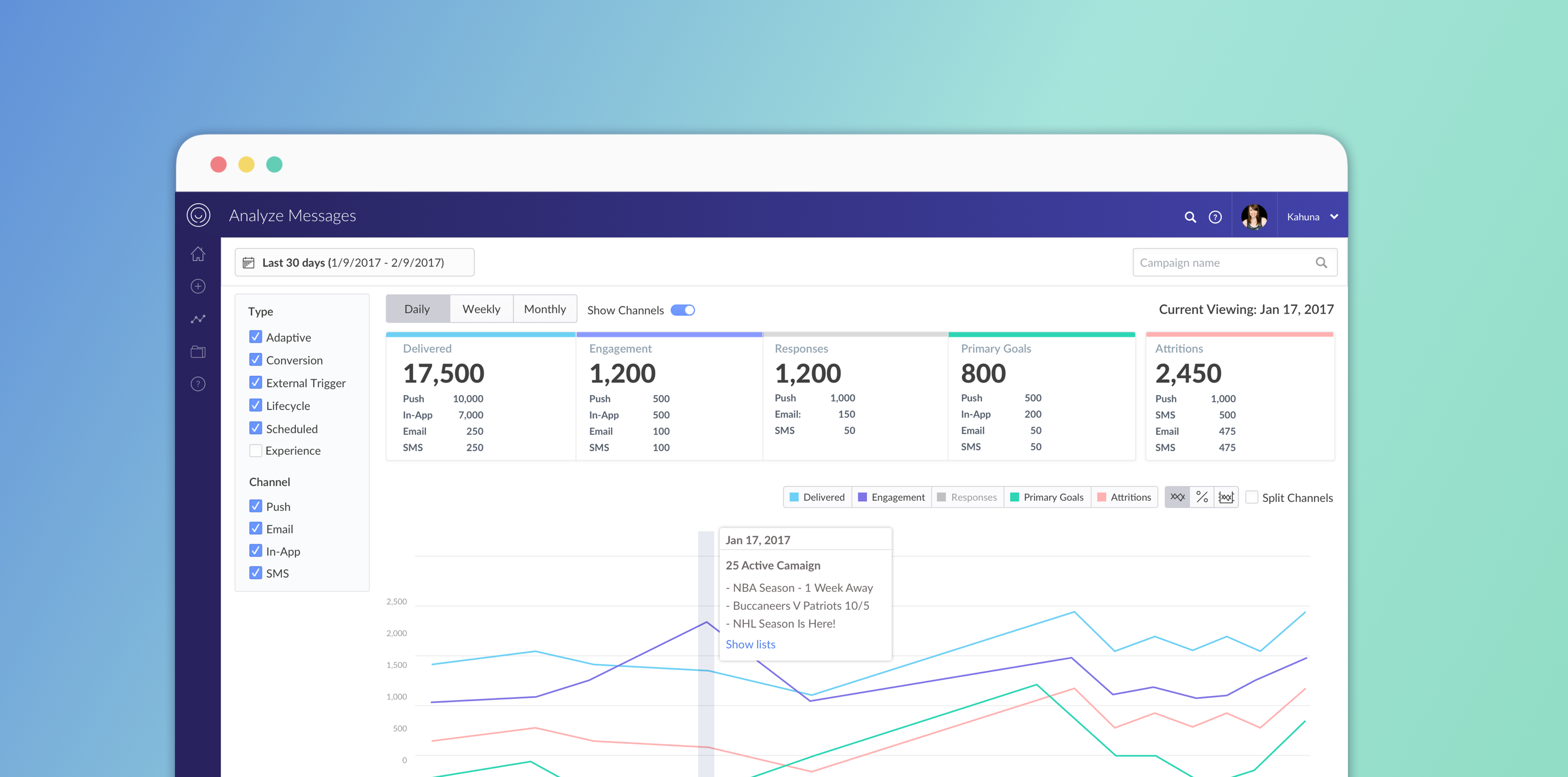
The high-fidelity prototype of Analyze Messages: left-rail filters, five outcome tiles, and a single comparable trend.
Walking the redesigned dashboard: changing filters, reading the tiles, and moving between trend and list.
Trend for the story, list for the campaign
The shipped dashboard has two complementary views. Trend answers whether performance is moving. List finds a specific campaign and keeps name and status in view while scrolling.
Key interactions
Filters update immediately
Changing type, channel, or date range updates the tiles and chart in place, so the left rail is a control surface rather than a form to submit.
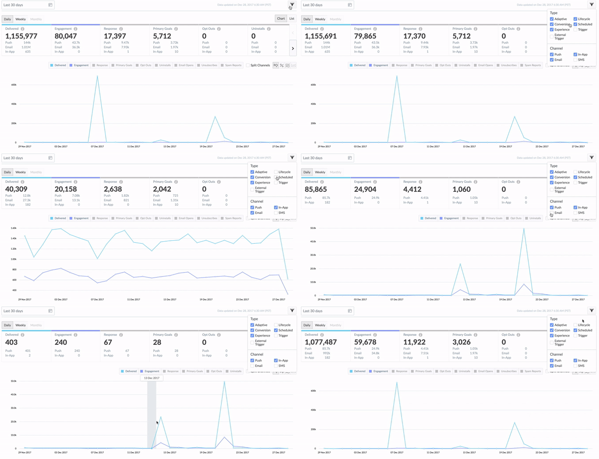
Adjusting filters and watching the dashboard respond without a page reload.
Legend, chart, and KPI stay linked
Clicking a legend shows or hides the series. Hovering the chart lights the matching KPI top bar, so the relationship between tile and line is visible rather than implied.
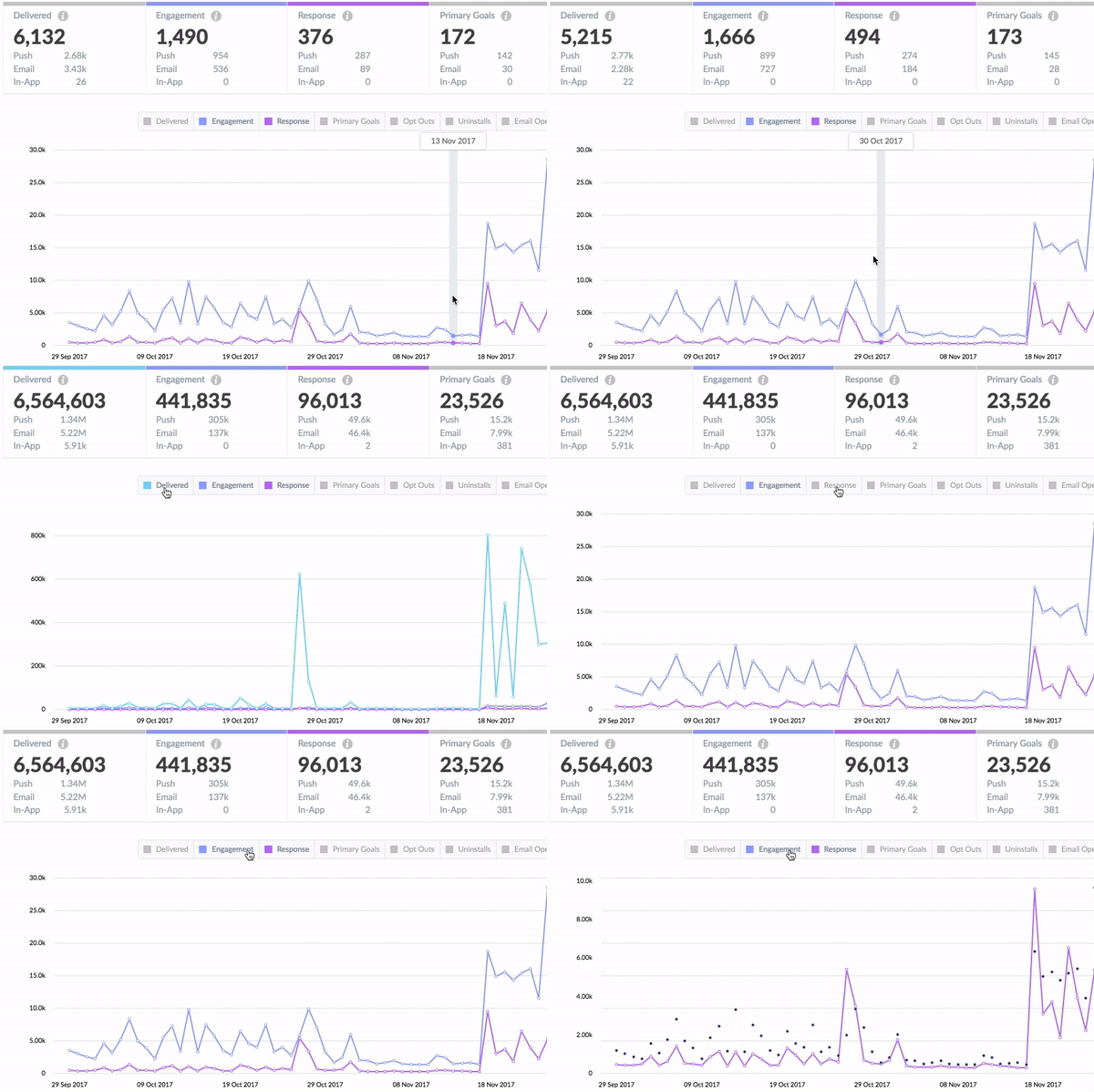
Legend clicks and chart hover highlighting the related KPI tile.
A list that stays oriented
The campaign table pins header, name, and status, so scrolling through hundreds of campaigns does not lose the row you were trying to compare.
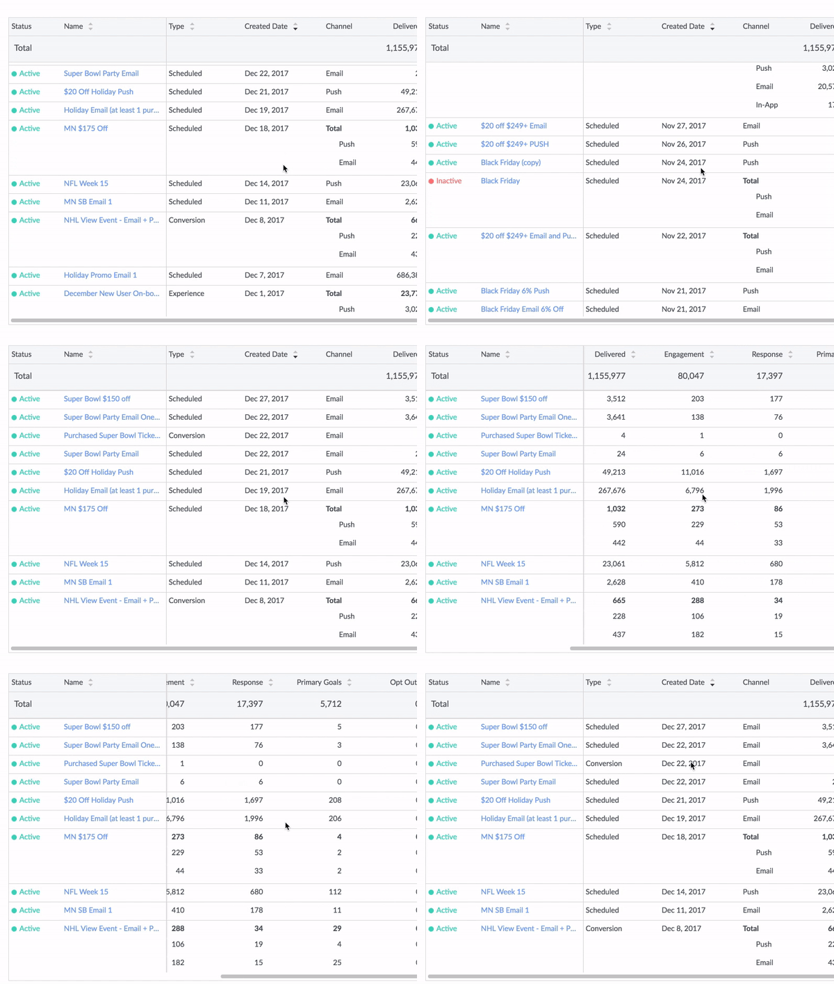
Campaign list view with a fixed header, name, and status column.
Trend view — outcome first, then a comparable chart across channels.
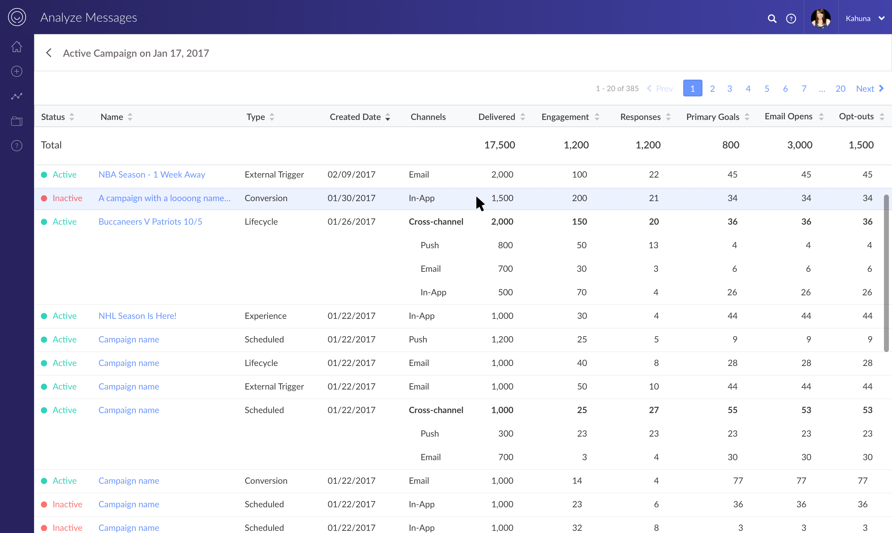
List view — find a campaign, keep status in view, expand a cross-channel row for detail.
The redesign gave marketers a performance surface they could scan: filters they could see, KPIs they could trust, and a path from business outcome down to a single campaign — without waiting for Kahuna to stop adding channels.
My involvement
I led UX for the campaign performance dashboard — research synthesis, information architecture, data visualization, and visual design — partnering with product and front-end engineering. Tara led development; David was the senior designer on the team; Justin oversaw the project.