- Company
- Kahuna
- Industry
- Marketing analytics, B2B SaaS
- Role
- UX Designer
- Scope
- Research, interaction, prototyping, engineering pairing
- Team
- Product, Design, Engineering
Turning AND/OR audience logic into blocks marketers could build without SQL
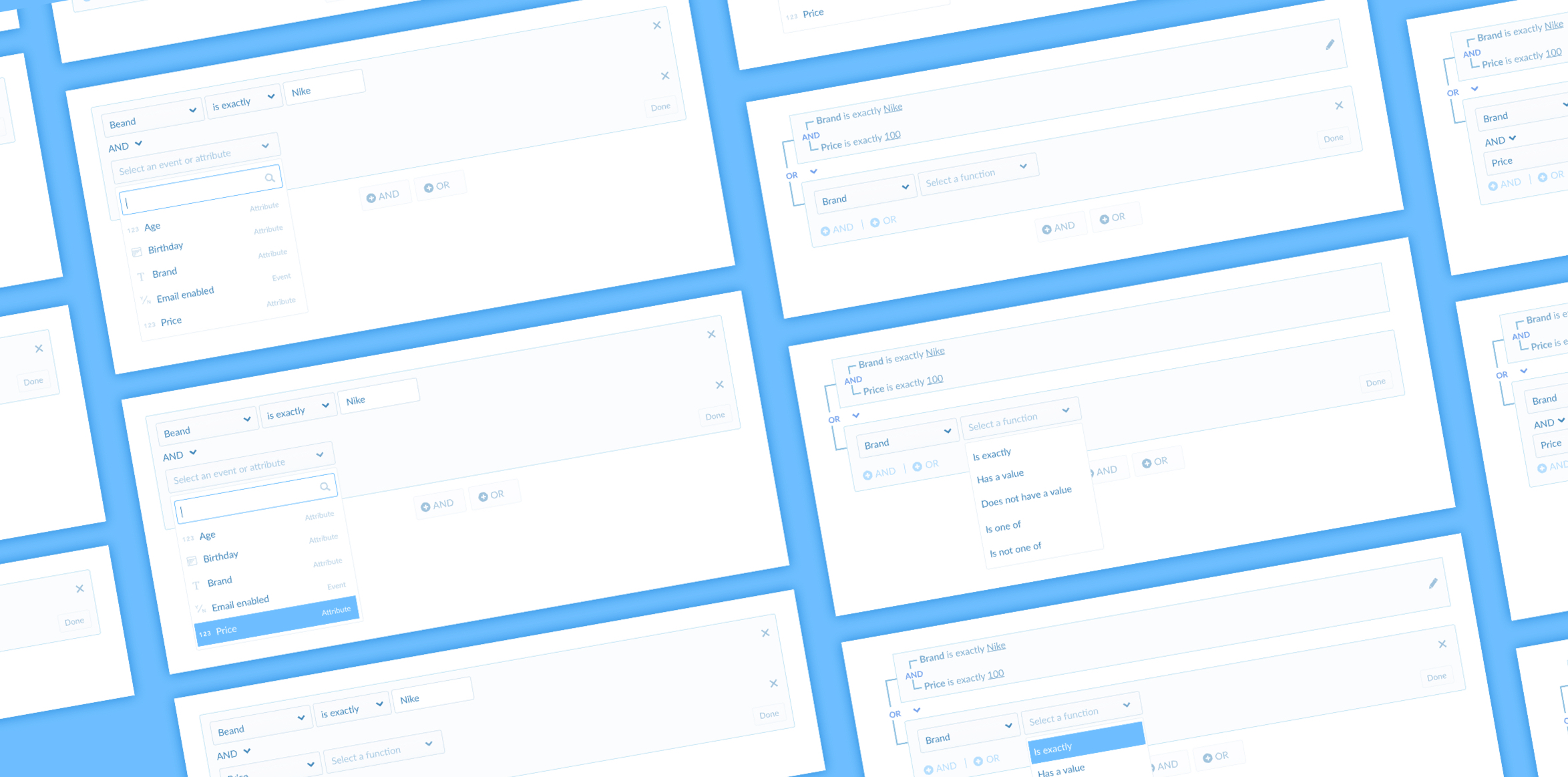
Summary
I redesigned Kahuna’s segment filter editor so marketers could compose nested AND/OR audiences in the campaign flow — without dropping into SQL, and without a wizard whose colors, icons, and edit rules they could not trust.
Competitive analysis and internal tests pushed us toward a block model: a group is a group, AND/OR can sit inside or between blocks, and a Done action collapses the set into plain English with the relationship drawn as a tree.
The context
When a marketer creates a campaign, they have to name the people it is for — by demographics, product behavior, user attributes, or a mix. That definition lived in the segment filter editor, inside the campaign-creation flow.
My goal was to rethink the workflow and the interaction so targeting the right group did not require a specialist.
Design challenge
Give marketers a way to build nested AND/OR segments in place — including groupings most tools could not express — without sending them to a SQL editor they did not know how to use.
Anything beyond AND meant writing SQL
The in-flow editor only supported AND once a marketer added more than two criteria: people who match A and B. OR, or anything nested, meant leaving the campaign and writing the logic directly in the filter editor. Most marketers did not know how to write that script.
Without a flexible segment, campaigns spoke to the wrong people — and engagement dropped.
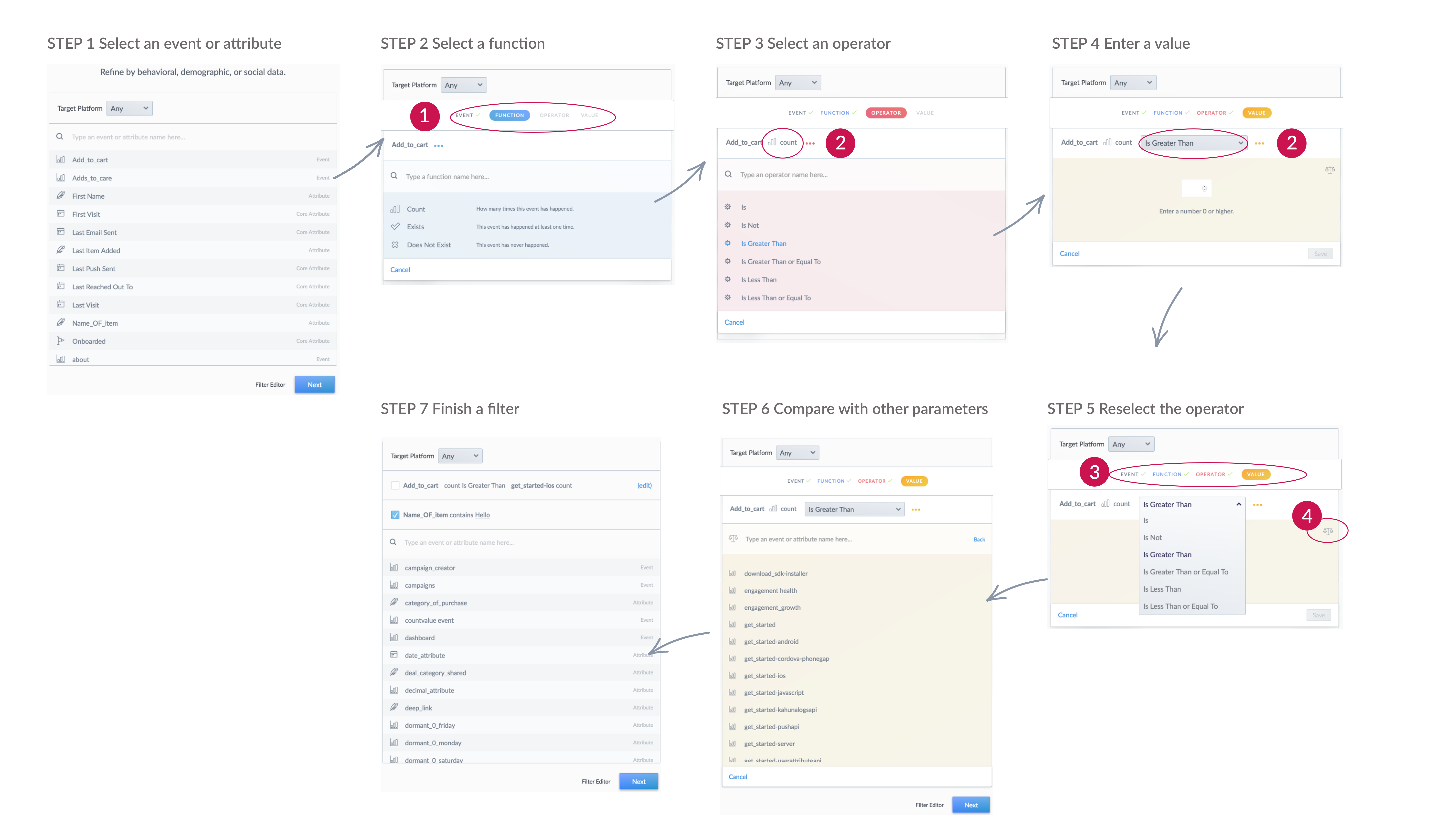
The existing editor was a colored wizard: Event → Function → Operator → Value. Each step was a new screen, and the Libra icon for dynamic parameters was easy to miss.
What Customer Success kept hearing
- Confusing navigation — it was unclear what event, function, operator, and value each meant.
- Inconsistent interaction — some steps let you change a value after choosing it; others did not.
- Wrong use of color — red and yellow were meant as highlights, but people read them as errors.
- An invisible power feature — the Libra icon created a dynamic segment without multiple campaigns, and most people never noticed it.
What other editors allowed — and where they stopped
I looked at how competing platforms structured filter logic, to see which interactions felt clear and which common cases they still could not express.
Competitive notes
Appboy — clear blocks, limited grouping
Intuitive structure, drag-and-drop reorder, and an estimated audience size. AND/OR existed, but OR only inside a block and AND only between blocks — so (A and B) or (C and D) was impossible.
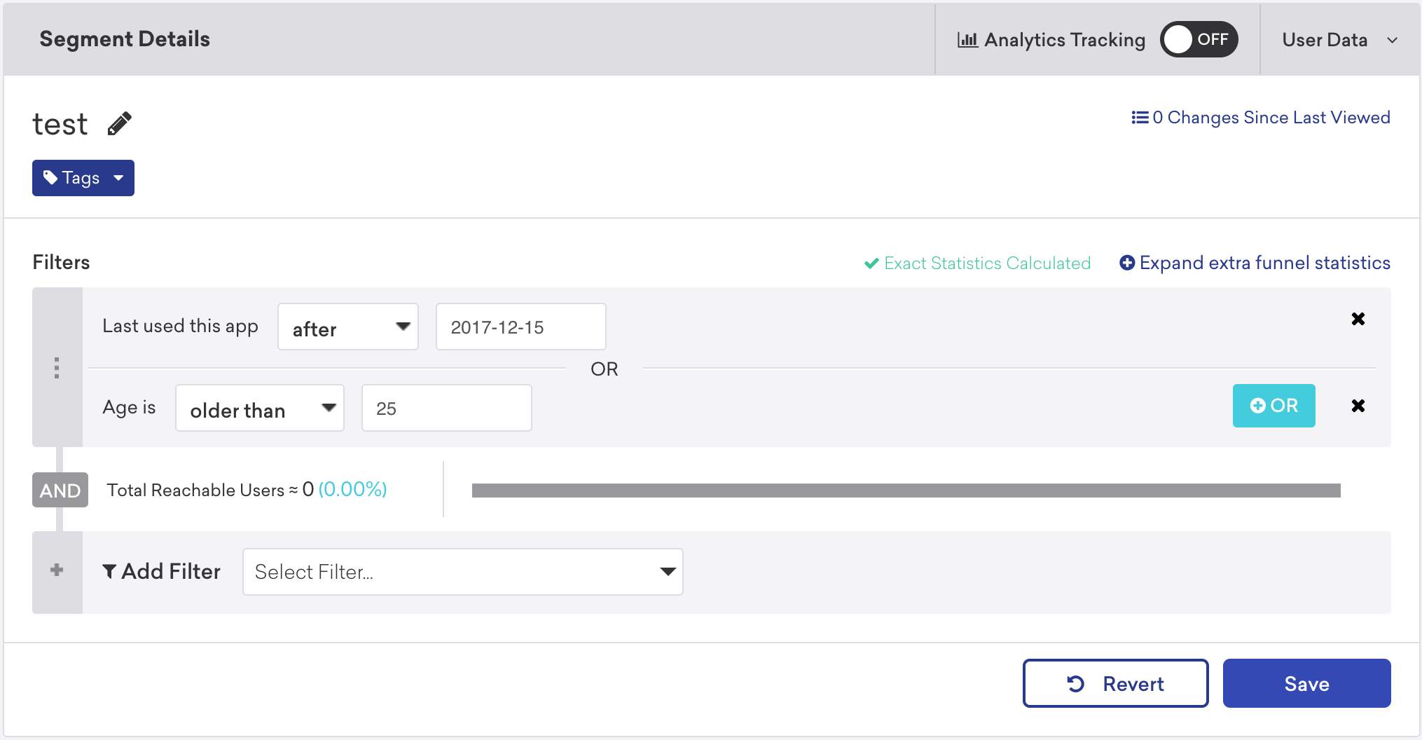
Appboy’s segment filters: an OR group with a reachable-user estimate underneath.
Leanplum — reads as a sentence, AND only
Multiple values in one criterion, and the criteria formed a sentence as you built them. More than two different criteria still collapsed to AND.
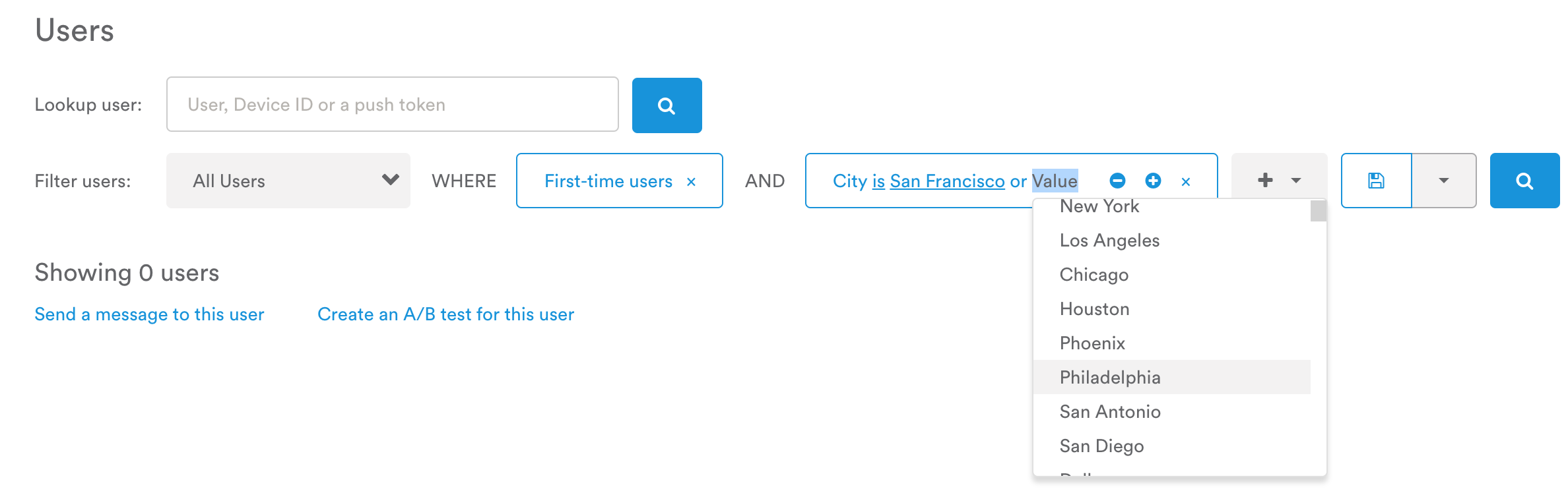
Leanplum’s filter reads as a sentence, with extra values added inside a single criterion.
Grouping is the product, not a detail
Once AND and OR sit in the same filter, grouping changes the result. (A and B) or (C and D) is not the same as A and (B or C) and D — and most platforms could not express the first.
A typical case: (Favorite Brand is Nike and Price is under 50) or (Favorite Brand is Adidas and Price is under 60). After talking it through with product, we decided to let people place AND/OR anywhere, not only in a prescribed nest.

The same four criteria, two groupings, two audiences. The editor had to make that difference visible, not just possible.
Open the flexibility: AND and OR can be added inside a block or between blocks, so marketers can describe the grouping they actually mean.
A block should feel like a group
I prototyped two directions and tested them with product managers and internal marketers. Solution 1 won: a block meant a group, and AND/OR could be added inside or outside it. Solution 2 put too many options on the first screen — people stalled.
Two prototypes
Blocks as groups
A card is a group. + AND / + OR inside the card nest; the same actions below the card add a sibling. Testers read the structure without a tutorial.
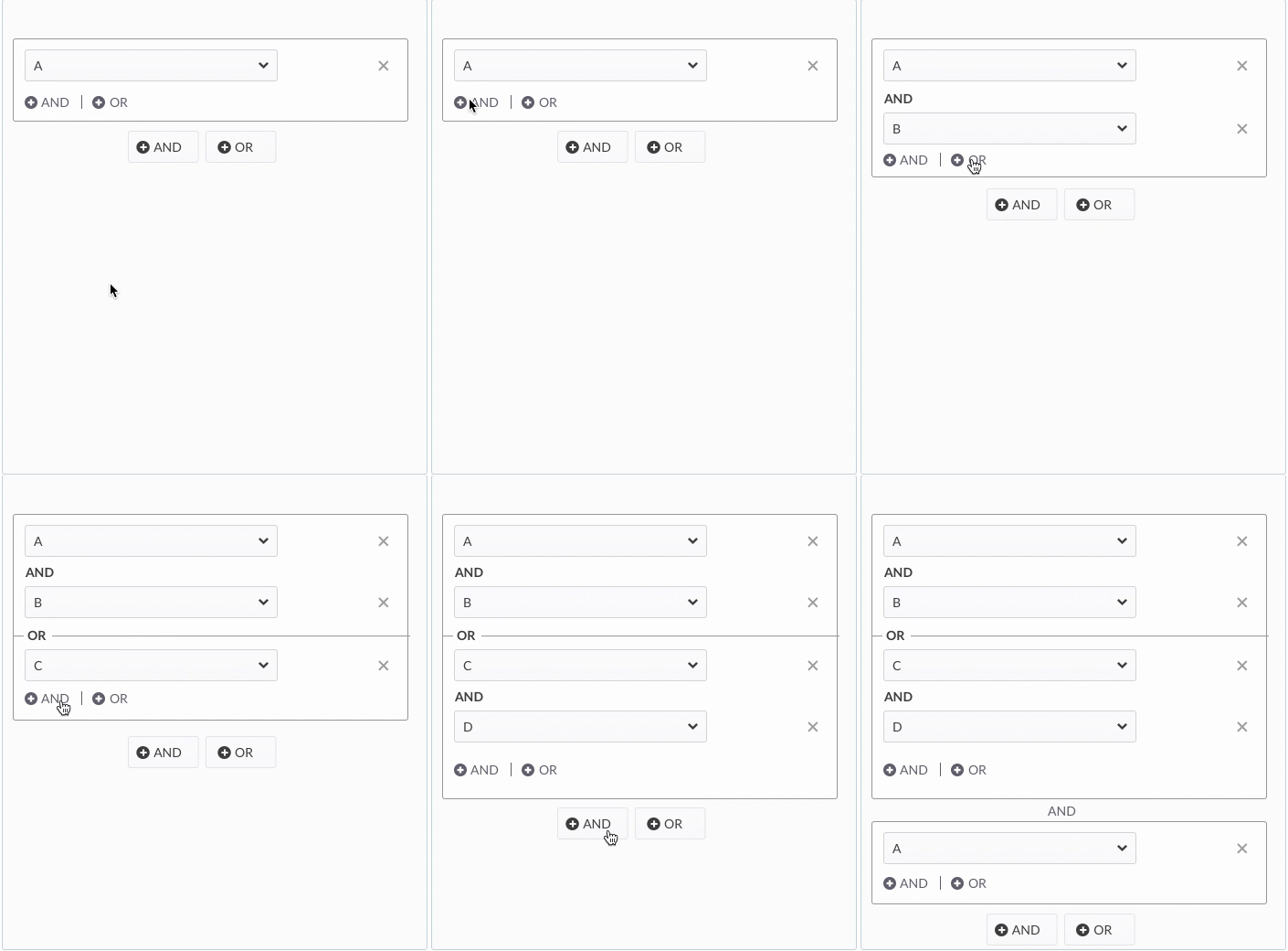
Solution 1 — a group card with nested AND/OR and sibling AND/OR underneath.
A canvas with Add Filter / Add Group
A global AND/OR toggle plus separate buttons to add a filter or a nested group. More complete on paper, too many starting moves in the test.
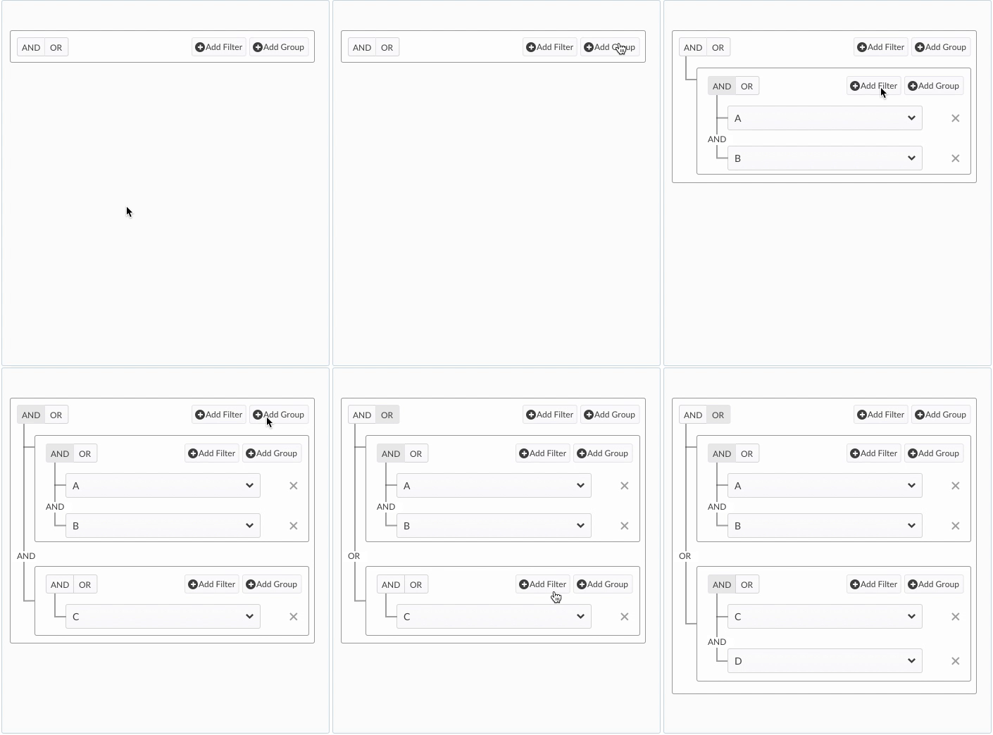
Solution 2 — an empty canvas with AND/OR in the header and Add Filter / Add Group.
Collapse the block so the tree can be read
Once a segment got deep, the nested fields were hard to scan. Connecting lines between the first two criteria and the third were easy to miss. I ran several rounds with product on how a finished group should look.
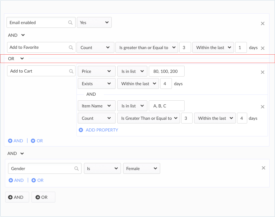
A fully expanded nest. The logic is there, but the grouping is easy to lose — especially the line that separates the first pair from the third criterion.
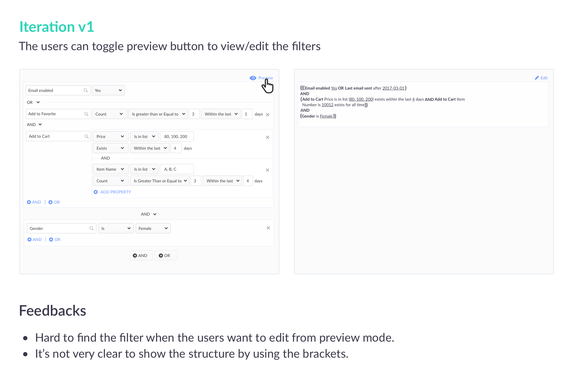
v1 previewed the filter as nested parentheses. Feedback: hard to jump from preview back to the right row, and brackets did not show structure.
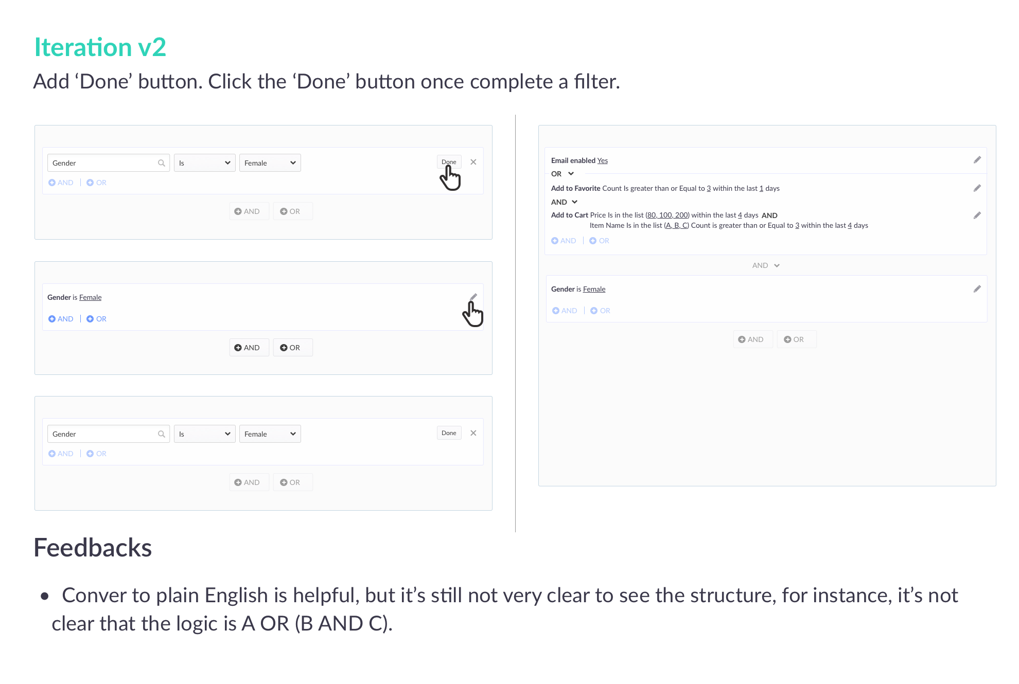
v2 converted each row to plain English. Helpful, but still unclear that the logic was A or (B and C).
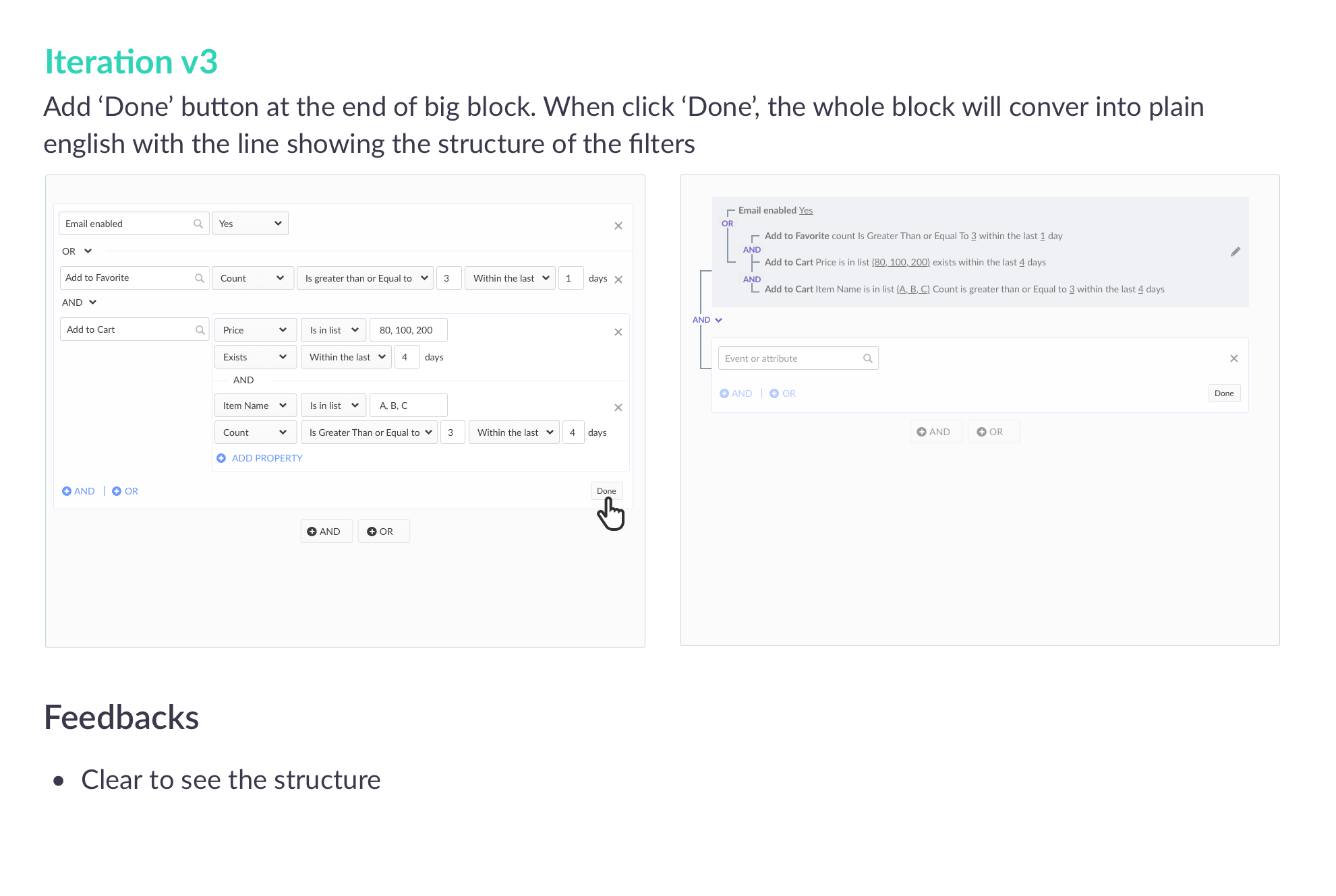
v3: a Done button inside the block. Completing a set collapses it to plain English, with lines that draw the relationship. Testers could finally see the structure.
Edit one block at a time. Hit Done, and the set collapses to a sentence with a visible tree. A pencil opens that block again without unfolding everything else.
The small behaviors that made the model usable
The structure only held if the micro-interactions were tight. These three were the ones testers felt most.
Key interactions
Edit one block at a time
Done or the pencil collapses the current block into plain English so the rest of the tree stays readable while you work.
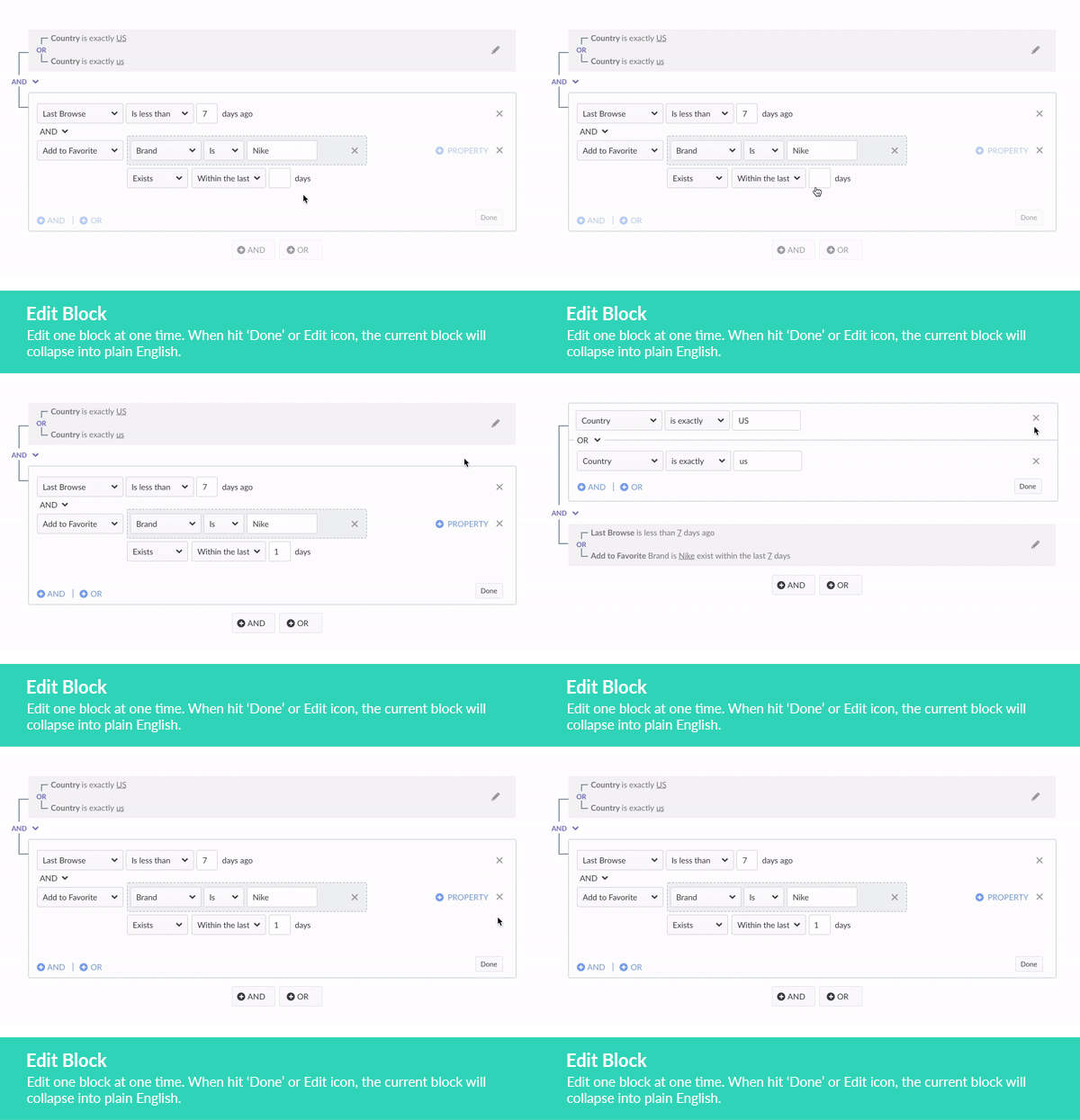
Opening a block to edit, then collapsing it back to a sentence.
Validate on blur
Clicking outside the block runs validation, so incomplete rows surface before the marketer thinks the segment is done.
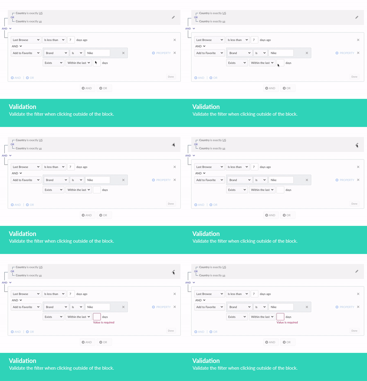
Leaving a block triggers validation on unfinished fields.
Autofocus and autocomplete
Opening Event or attribute puts focus in search immediately, with autocomplete as you type — the old wizard’s four labeled steps, in one field.
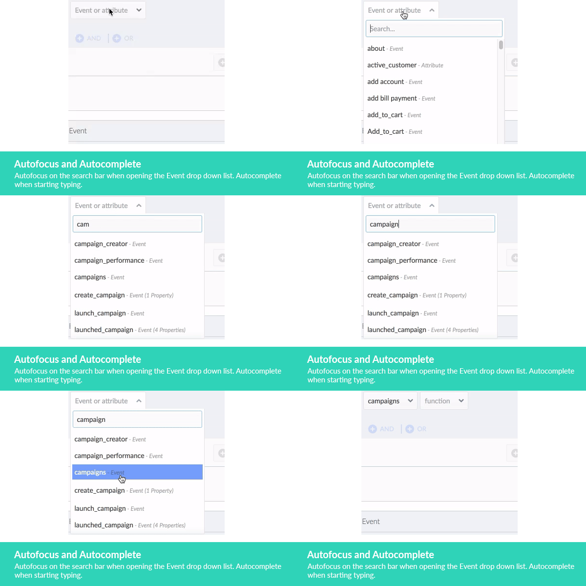
Search opens focused, with autocomplete for events and attributes.
A filter marketers could read back to themselves
After the tests, I paired with a front-end engineer on the interaction spec so the nested lines, Done collapse, and validation behaved the same in product as they had in the prototype.
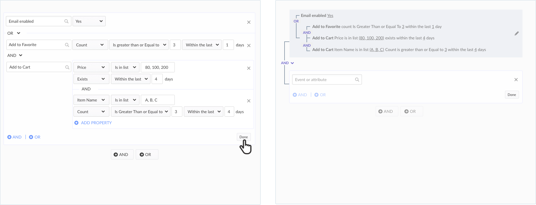
The shipped pattern: build in fields, Done, read the tree. The grouping is visible without parentheses.
Building a nested audience: search an attribute, add AND/OR, Done to collapse, keep going.
Marketers could describe the audience they meant — including (A and B) or (C and D) — without writing SQL, and could still read the logic after the block was closed.
My involvement
I led the interaction redesign — competitive analysis, prototyping, and iteration with product and internal marketers — then paired with a front-end engineer to specify the micro-interactions for implementation.